THIS LITTLE CLASS OF MINE
  • Home
  • Contact Me
  • Lesson Plans

Zentangle pumpkins

10/18/2016

2 Comments

 
Picture
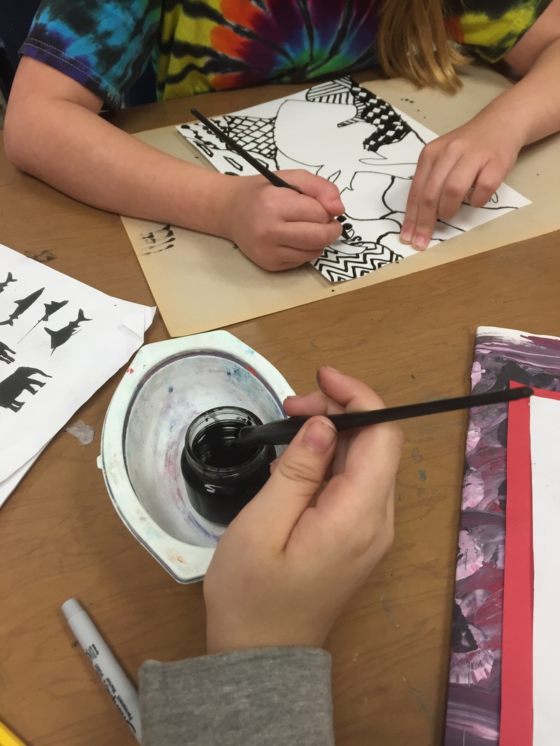
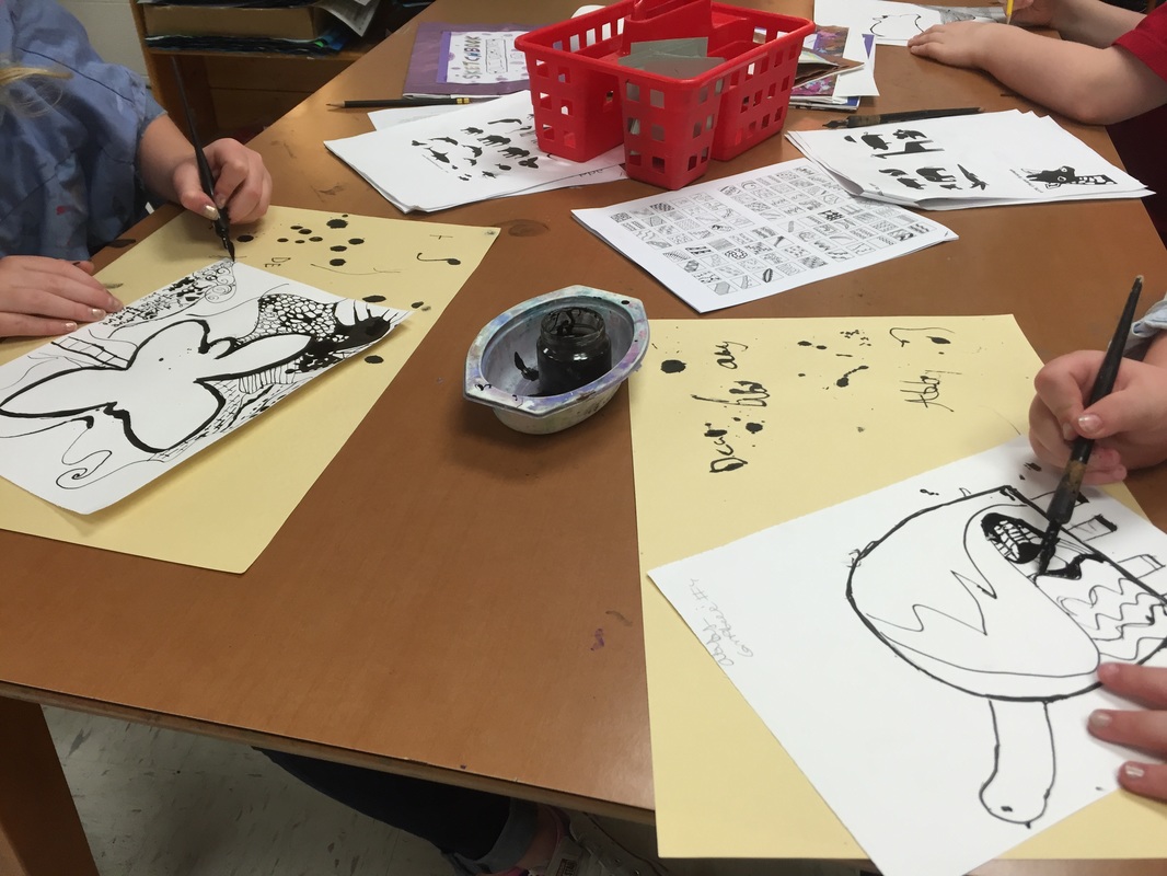
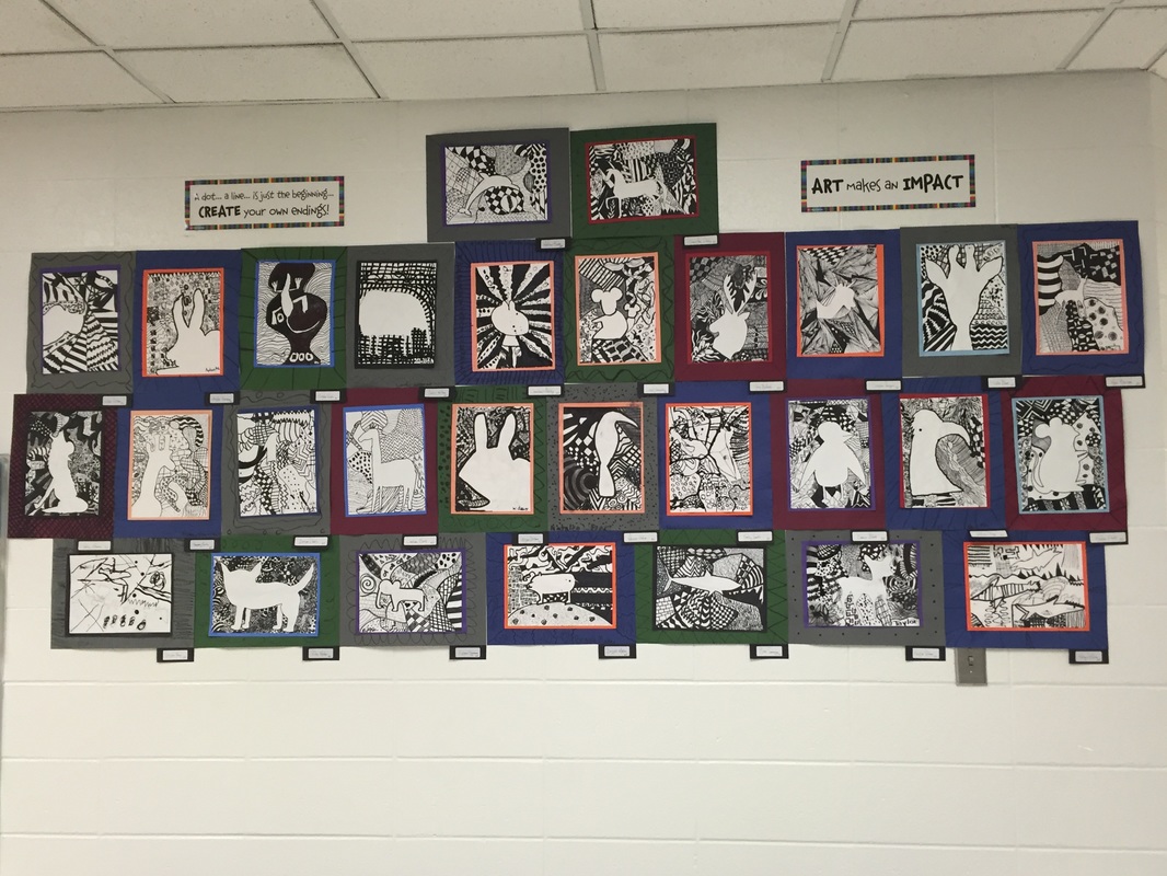
At the end of last semester, I taught my classes about zentangling with a zentangled animal silhouette project.  It went really well and they LOVED using the pen and ink.

This semester, I knew I wanted to incorporate zentangling again. I ended up getting really sick and had to leave part of this project with a sub. Surprisingly, zentangles are pretty easy to leave with a sub---yay! But I did not have a chance to let them try out pen and ink. Boo. 

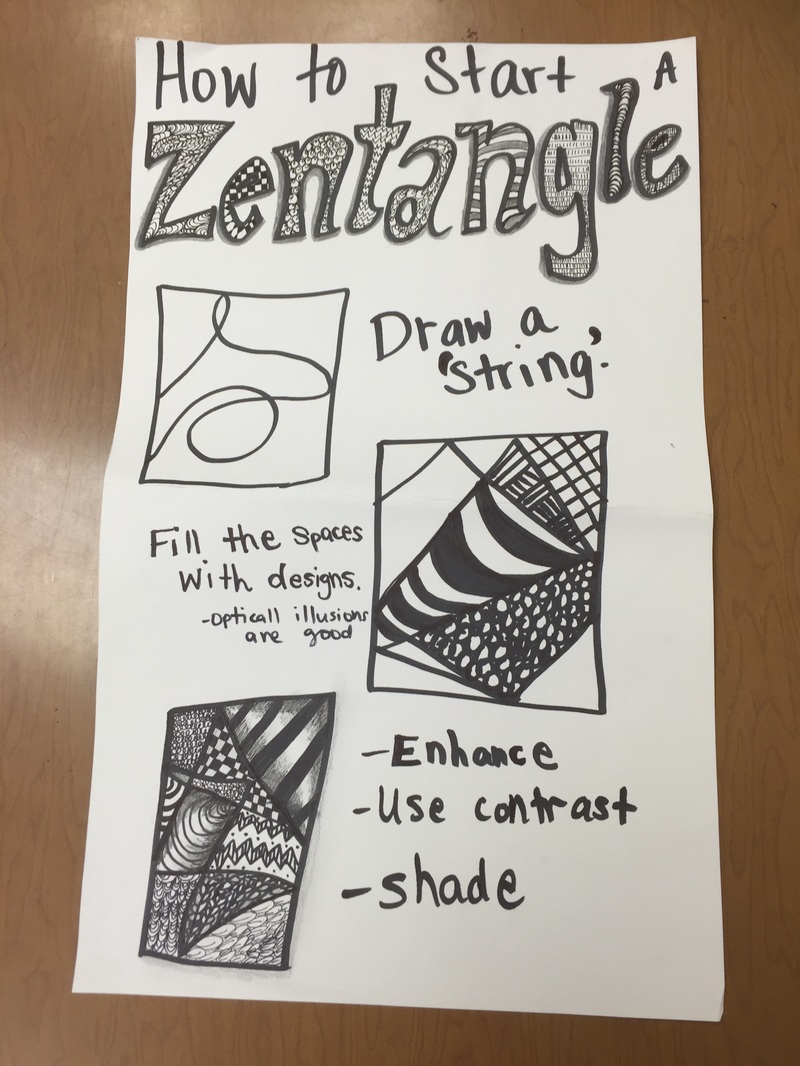
​Here is what I had posted on the board:

Picture
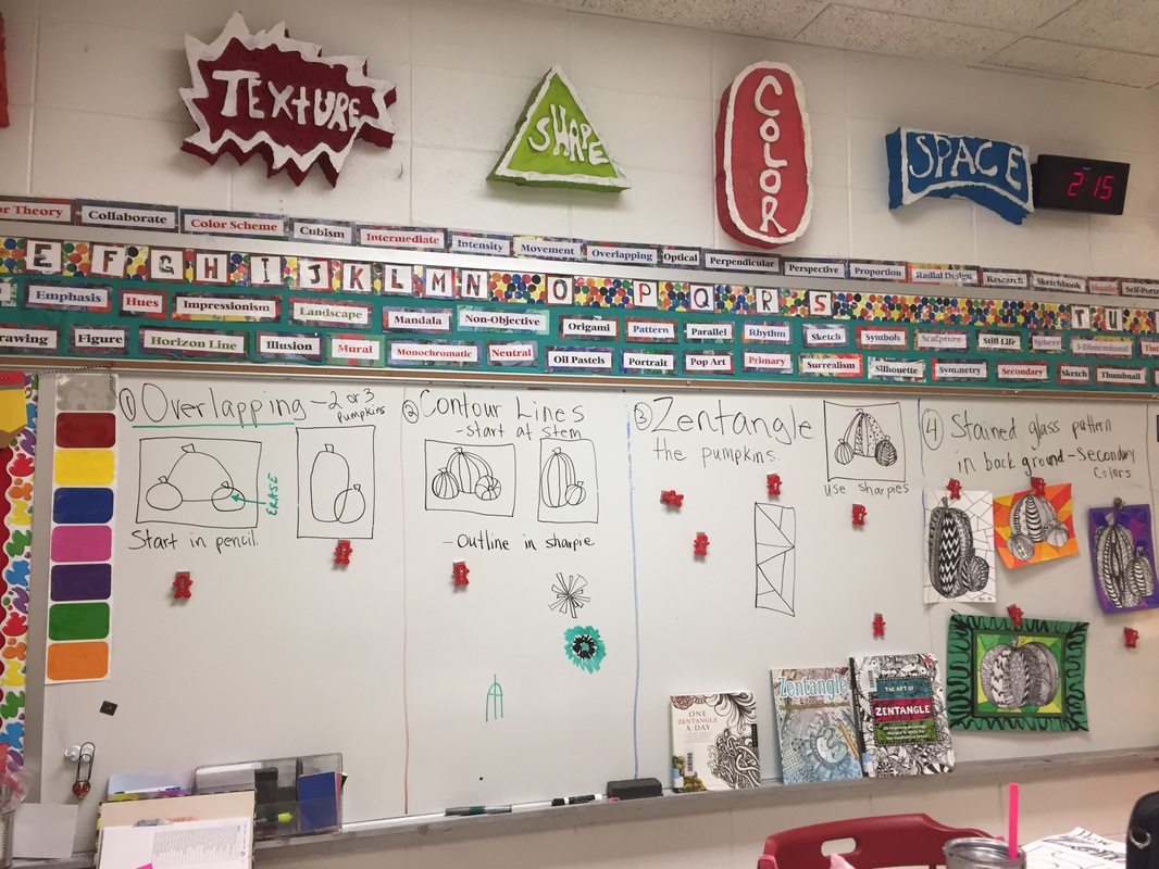
Here is what I left for my sub:
​
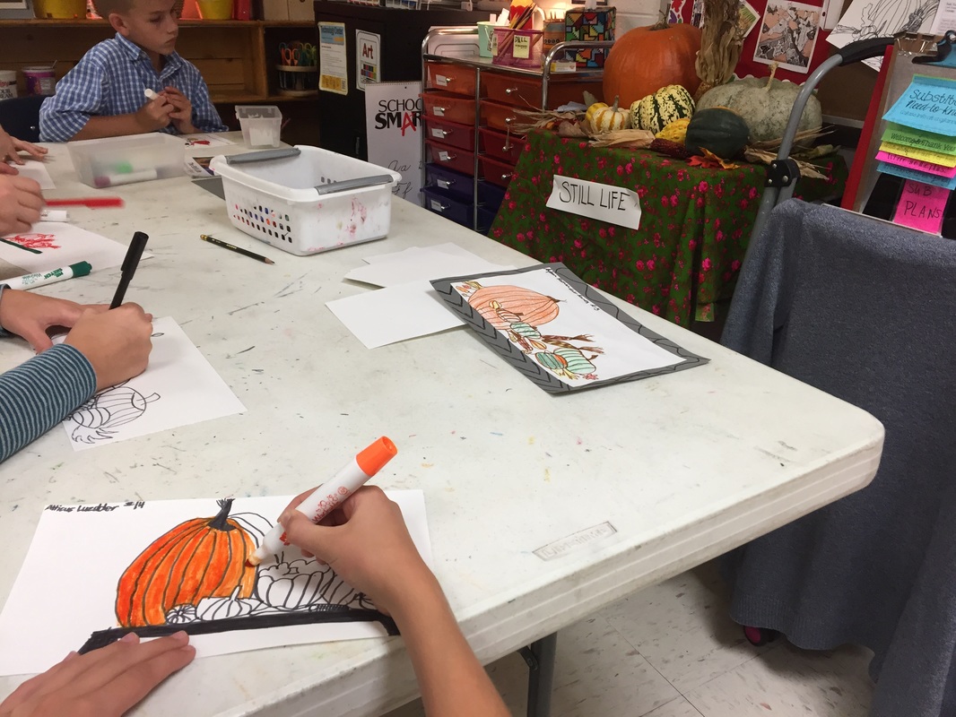
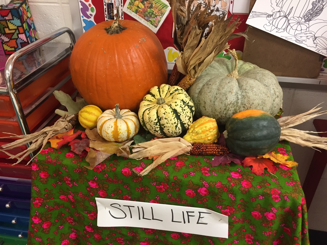
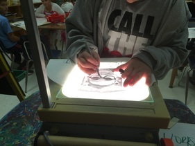
  1. Today students will be drawing pumpkins! I set up a pumpkin still life by the red bulletin board, you can point it out if students need help visualizing how to draw pumpkins. (Early finishers could also sit at the white table and create a contour line drawing of the still life. I put felt tip markers and white paper on the white table just in case…..)
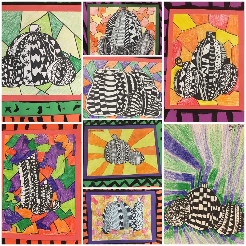
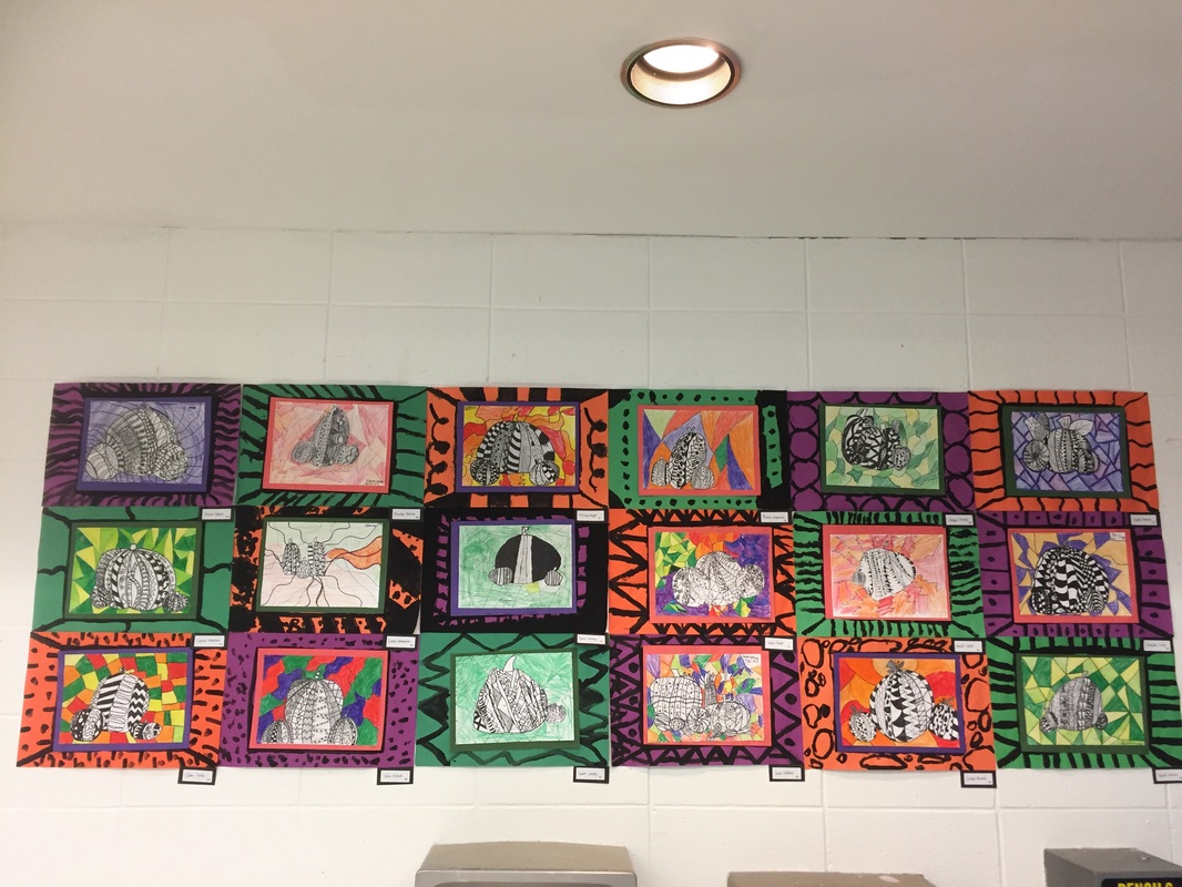
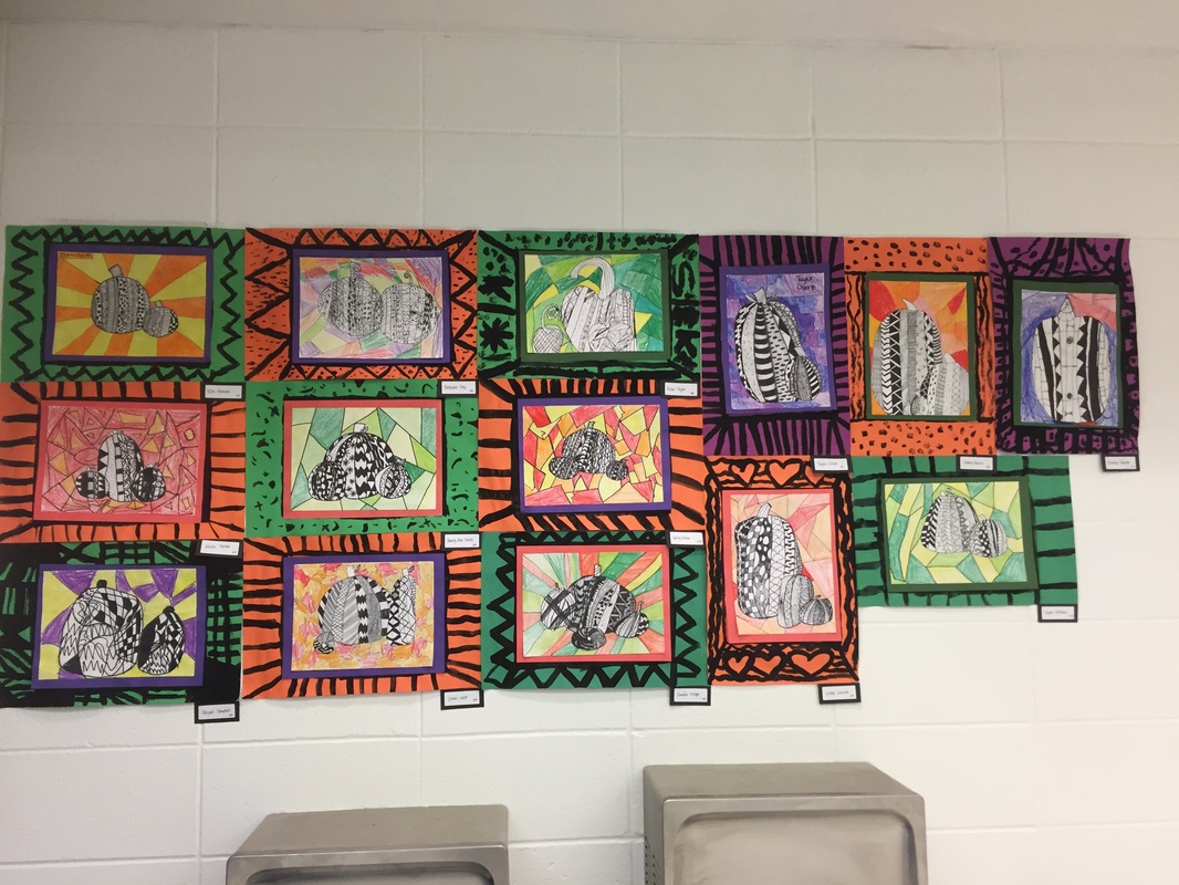
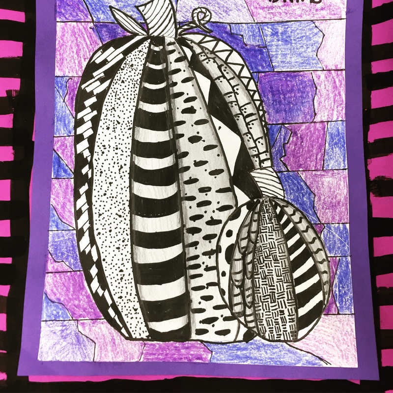
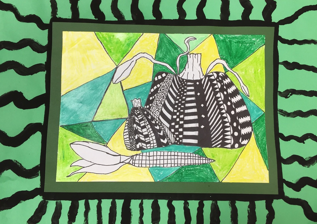
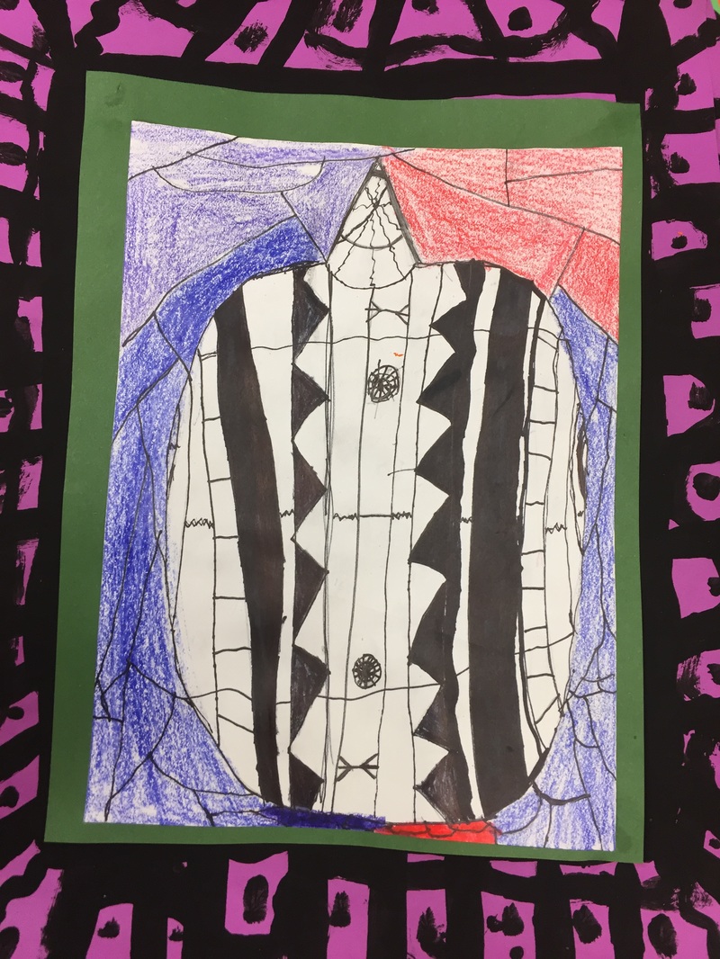
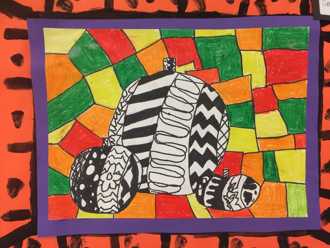
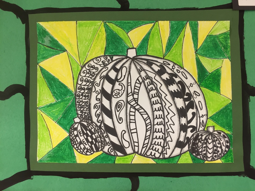
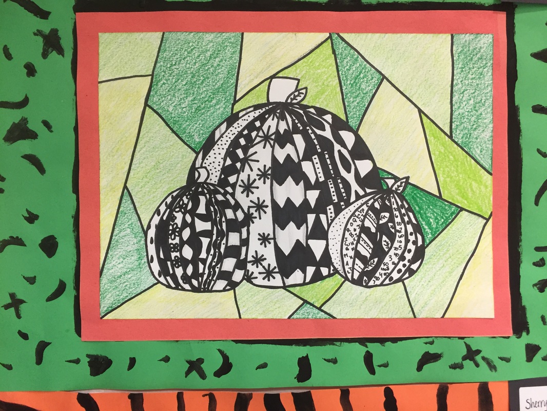
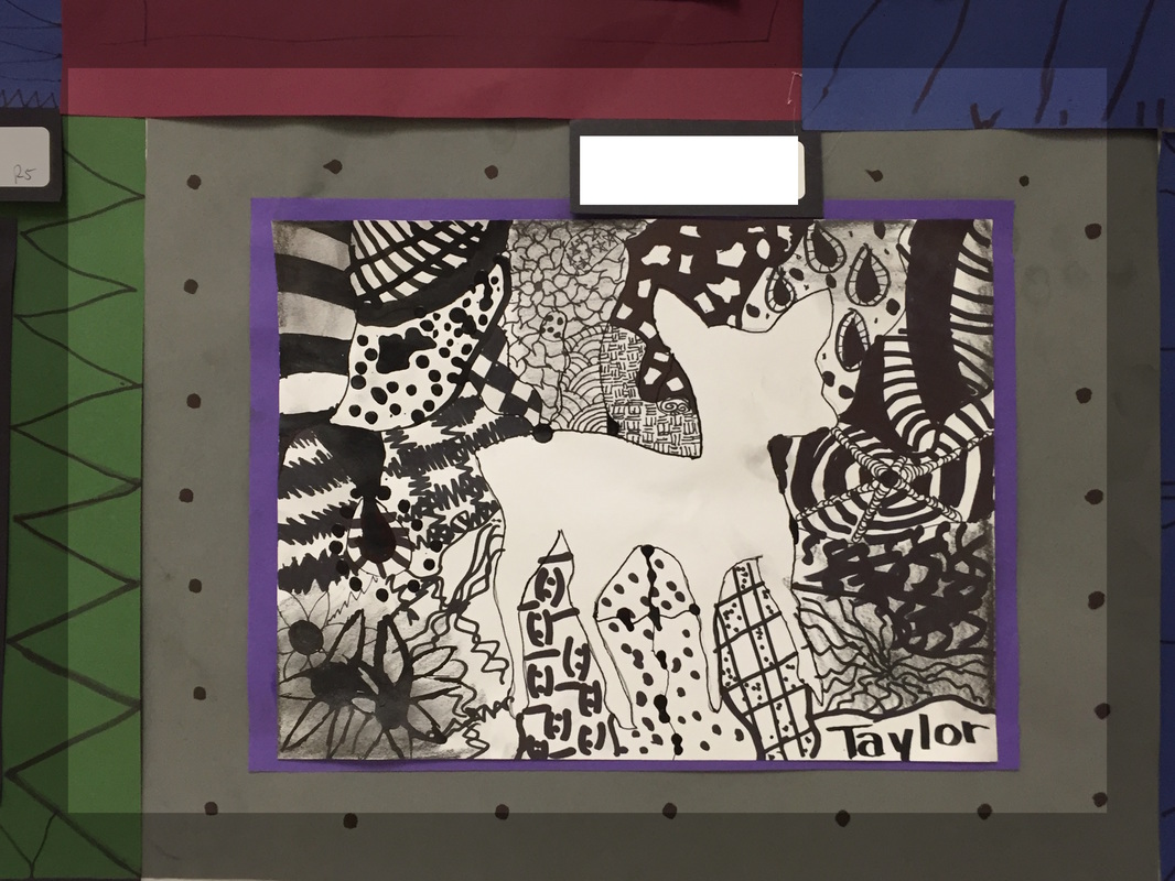
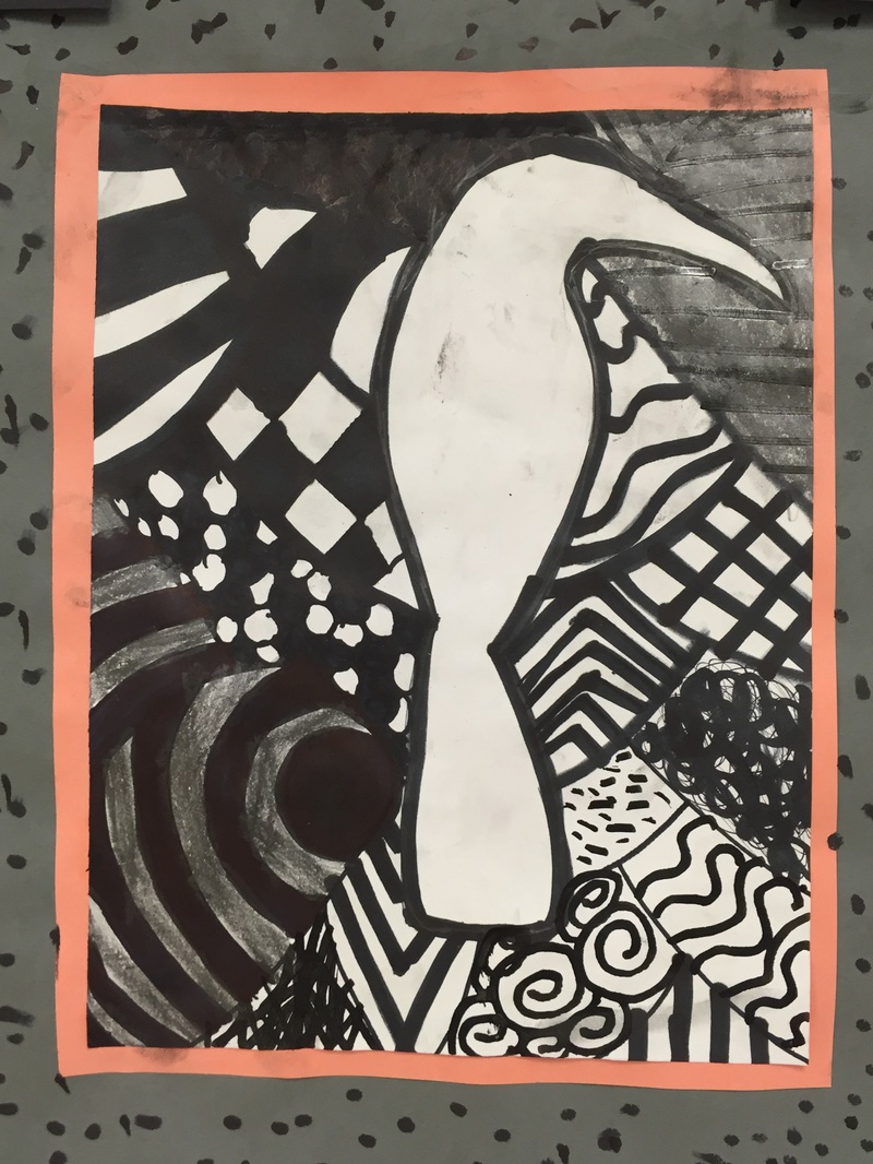
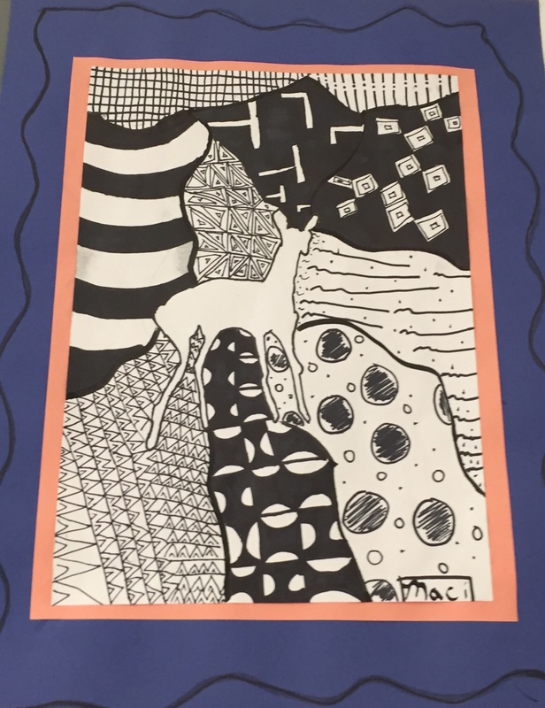
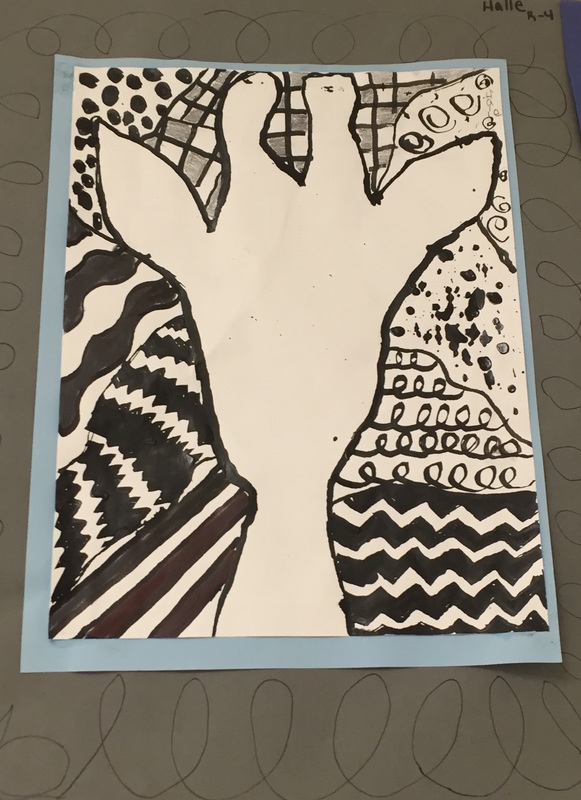
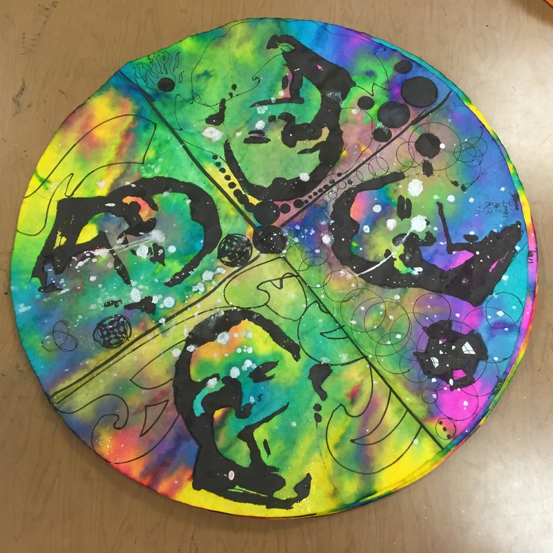
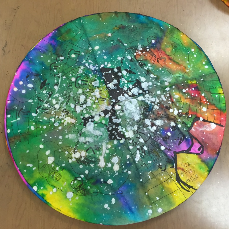
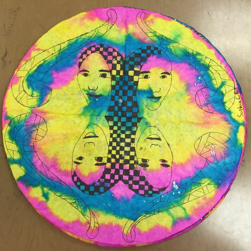
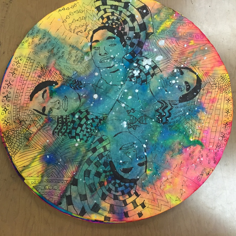
  2. On a piece of white paper, students may choose a composition 2 or 3 pumpkins overlapping. You can demonstrate this on the board or point out my example. One of our vocabulary words is OVERLAP, so you might explain that it means that one object is in front of another object so that it is partially covering the one that is behind.
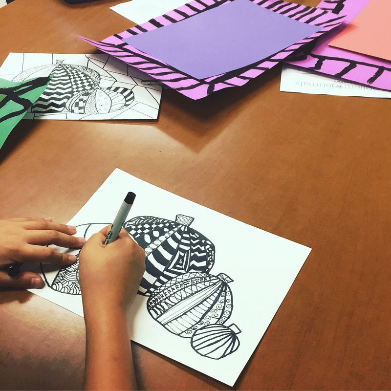
  3. After drawing the pumpkins, students should add contour lines that start at the pumpkin’s stem and follow the curve of the surface of the pumpkins. Students can draw the pumpkins with pencil, and then trace in sharpie. If they mess up, make them use the back to retry, before giving them a new paper.
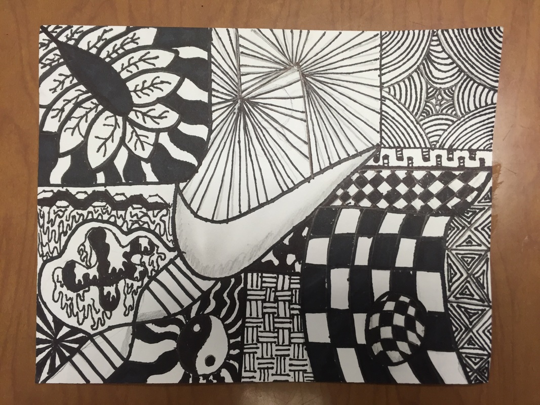
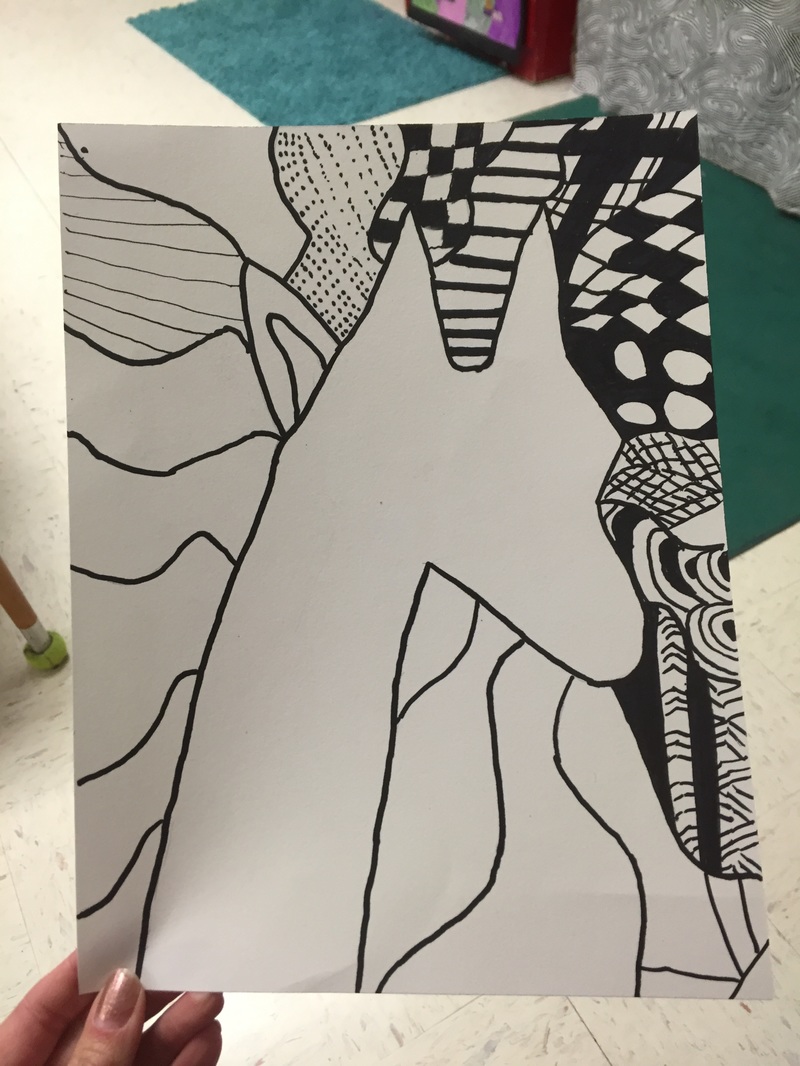
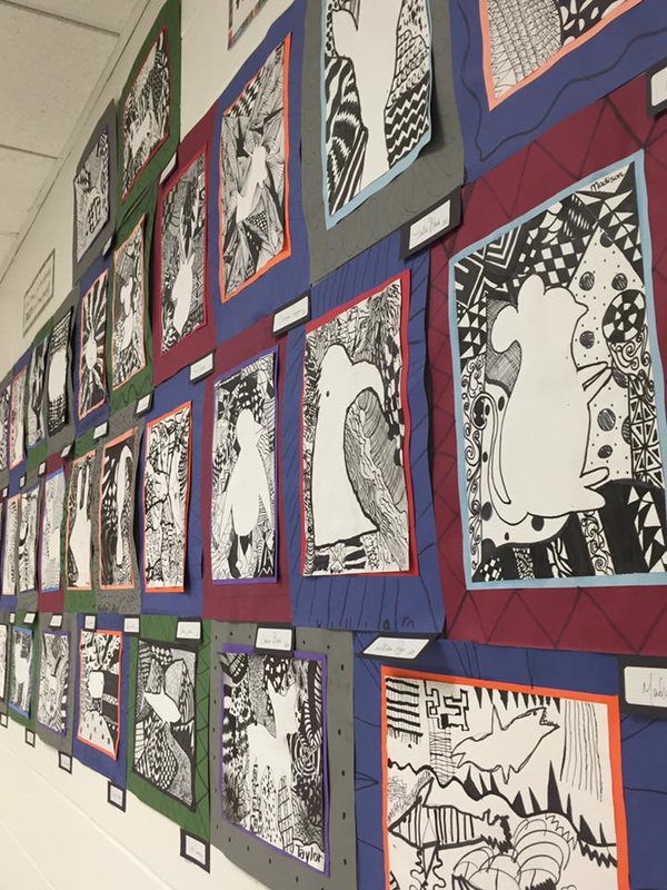
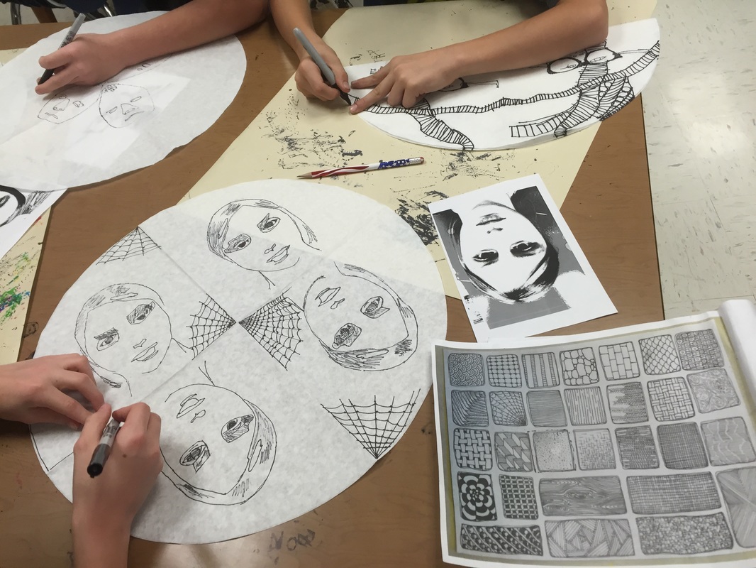
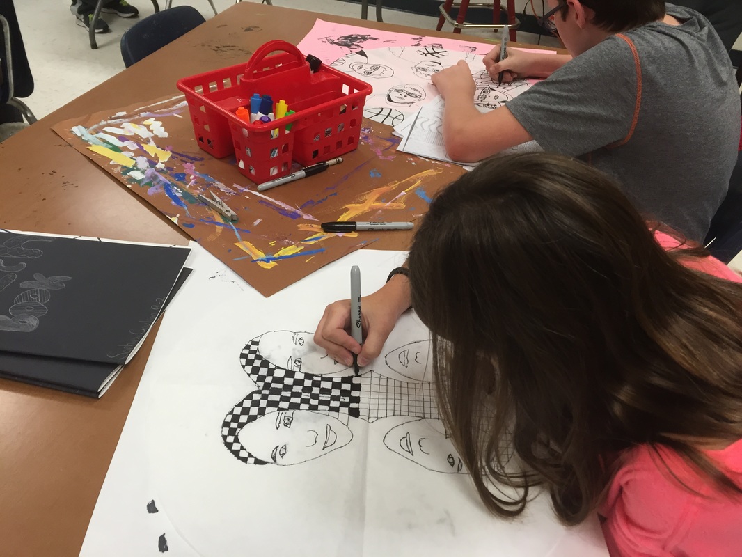
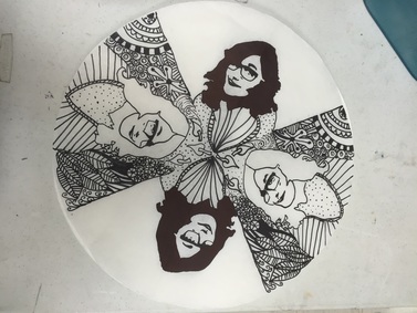
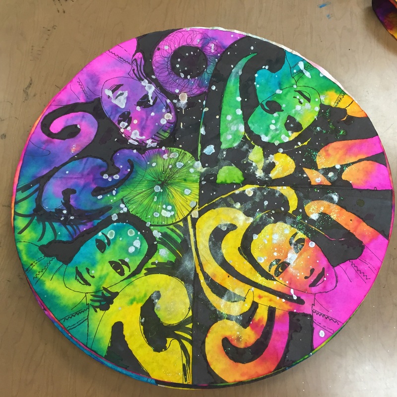
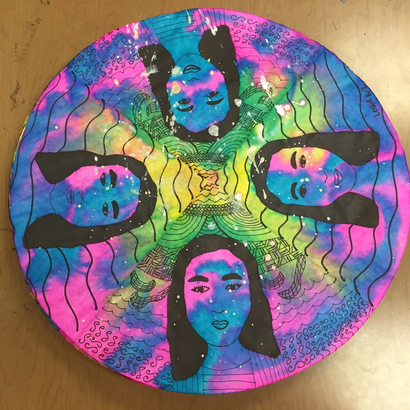
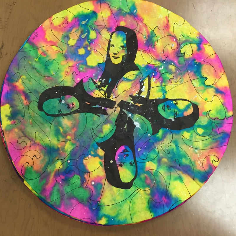
  4. After drawing the outline, students can begin ZENTANGLING in each section of the surface of the pumpkin using SHARPIES. Students can use skinny sharpies for this step. A zentangle is a design made up of structured patterns. I have a packet for each student to look at for ideas and a couple of books with tons of zentangle ideas. If their designs are too simple, they can go in and add more CONTRAST or VARIETY to make them look more interesting. Students should work quietly, zen implies a quiet focus and should be calming and relaxing. (6th graders should not wander the room to talk to friends. I do let them get a pencil, ruler or a sharpie if they need those items, but they shouldn’t be at another table for no reason). 
  5. Make sure names are on their papers. Remind them not to use sharpie on the back for their names because this will show through to the front and mess up their drawing. 
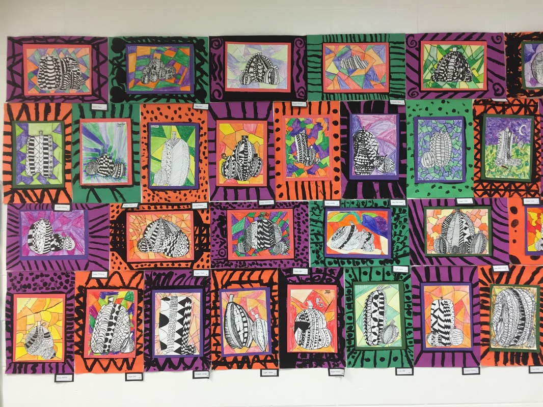
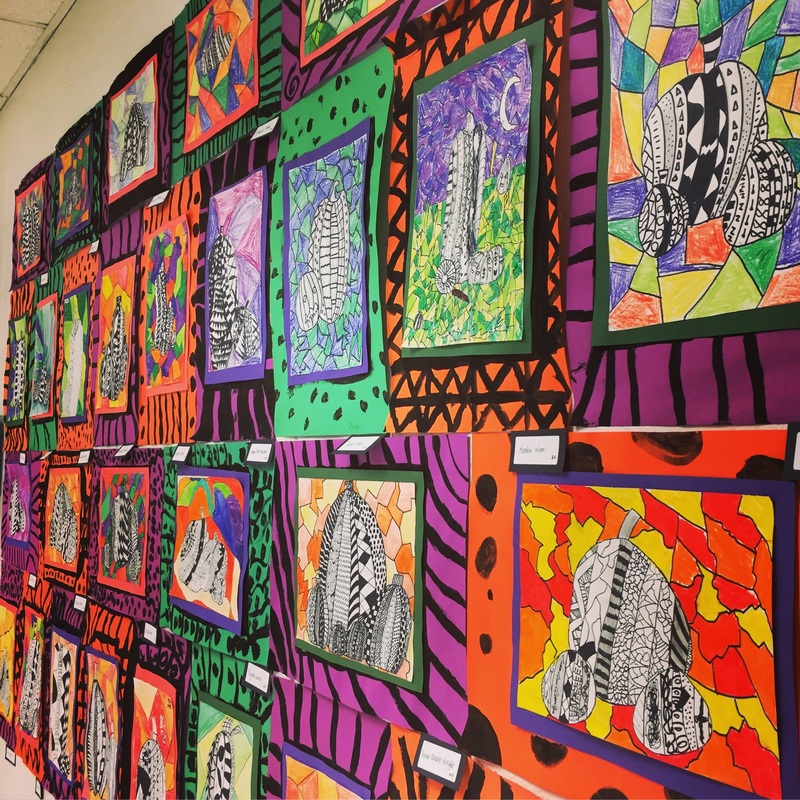
  6. *Next time* we will color the background and attach to a frame. Students will also have a little more time to finish zentangling the pumpkins if they don’t finish today. 6th graders will probably do better with this because we did zentangling last year. I don’t want them to color the pumpkin, the plan is to leave it black and white, and only color the background so if you allow them to get out crayons/markers if they finish early, make sure they don’t color the pumpkin. I want to explain how to use secondary colors on the background.
  7. Paper is 8X11 if you need to cut more.
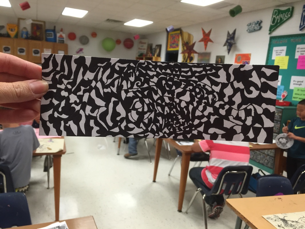
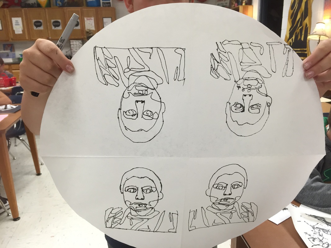
  8. Early finishers may either zentangle a bookmark or draw the still life at the white table.
 

Picture
When I got back from being sick, I explained how they could add more value to some of their mini optical illusions and to the edges of the pumpkins to make them look more round or 3-D. The ones that added the shading in pencil did a great job. I think I even spent a few minutes at the beginning of that class making a value scale in their sketchbooks and shading a sphere---just for practice!

I also stressed the importance of adding CONTRAST. I encouraged them to at least make a couple of their patterns BOLD like a checkerboard. 
​
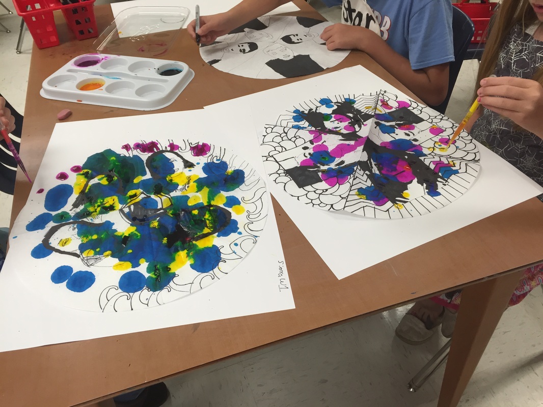
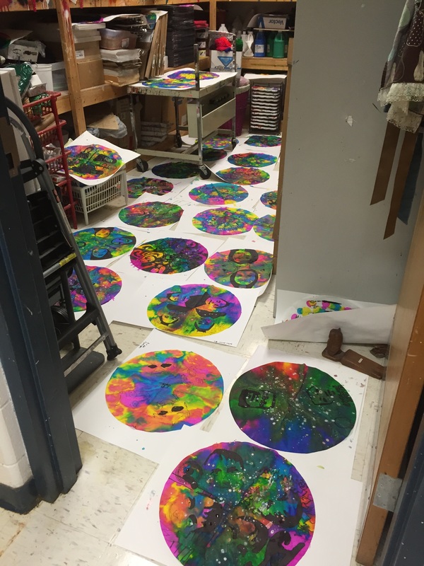
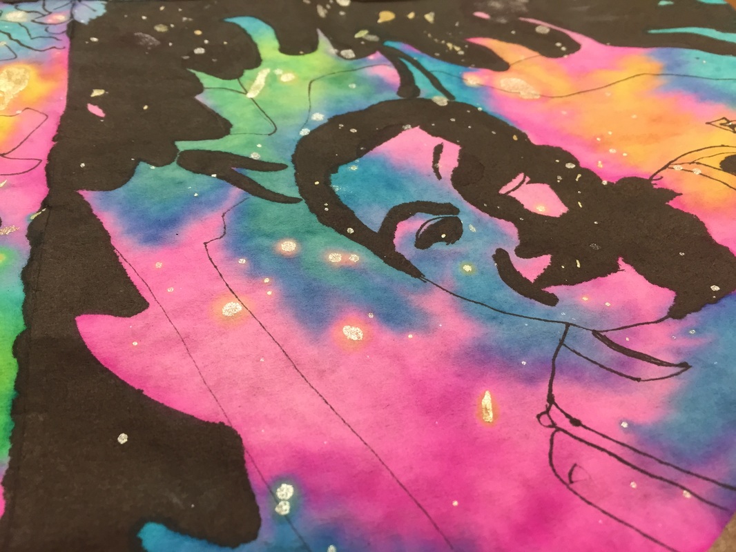
After zentangling, they were to color the background with SECONDARY colors. They could use a monochoromatic color scheme or a pattern, but I took all of the reds, pinks, yellows, grays, browns and etc. out of the crayon basket. Its amazing how beautiful the secondary colors are! I told them that I would keep yellow green, golden rod, red violet, and red orange in there to give them a variety of 'purples' 'oranges' and 'greens'. They also had to plan out what color they would use to 'matt' their artwork and they had to select a different shade of green, purple, and orange for their frames. They painted a design on the frame with black at a special painting station. 
Picture
Picture
Picture
Picture
Picture
Picture
Picture
Picture
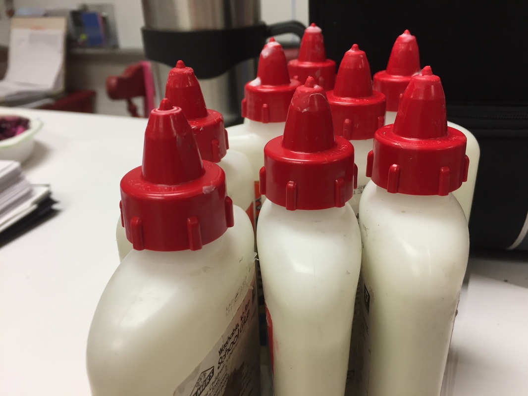
And a shoutout to the Tap and Glue caps I debuted on this project. It was the first time many of my students had used these caps. Some were elated! Some were perplexed. Regarless, I used half as much glue! And only a few mishaps for the ones who were absent the day I explained how to use them--who tried to take the top off and spilled glue EVERYWHERE. 

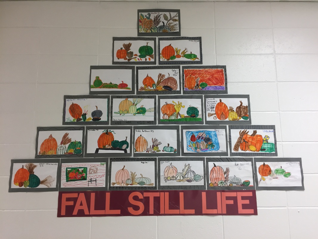
If students finished early, I had them work at a drawing station. I set up a STILL LIFE of pumpkins and gourds. Once again, I did not let them draw with pencil first, and I was really happy with the results!
Picture
Picture
Picture
2 Comments

ZentangleD Animal Silhouettes

9/21/2016

0 Comments

 
Picture
I love zentangles. My students love zentangles. My students love to zentangle so much they go home and zentangle more. The one above is from a boy who made 3 more mini zentangles at home! 

My students also love using India Ink and calligraphy pens to create a zentangle. This is seriously one of the first art supplies I have found that nearly all of my students are impressed by. I put the India Ink in a little glass jar and give them a calligraphy pen with a cover sheet on the table to help with clean up and they are in heaven, some of them even attribute the feeling to 'back in olden times' or 'what they used to sign the Declaration of Independence." They really feel special, and it elevates the project beyond just using sharpies. 

Picture
Picture
Picture

Day One

For the first day of this project, students practiced drawing an animal silhouette in their sketchbooks. A silhouette is harder for some students, because they have to get the contour line right, or else it doesn't look anything like the animal. I purposely made the silhouette handout have super tiny silhouettes so that they could not trace their design, this was about observational skills. 

After practicing the animal, they were to redraw it on white paper and outline with sharpie. For this project, we were not coloring the animal, we left it white, and created zentangles all the way around. 

To make a zentangle, you bascially just make lines or 'tangles' around the object, all the way to the edge of the paper to break it up into sections. You fill the sections with structured patterns. 
Picture

Day 2

Now that they know about making a silhouette, it is time to learn about a zentangle. A zentangle is a design made up of structured patterns. I have another packet for students to look at today, comprised of mini optical illusions, patterns, and cool looking zentangles they can reference as they work. 

Zentangling can be addictive. Some of my students loved it so much that they went home and zentangled more. 

We used skinny and regular sharpies along with the black india ink and calligraphy pens. Some students did not like using the calligraphy pens because of the unpredictability. That was okay with me, as long as they tried it. Also, if they accidentally dripped the ink in the wrong spot, I told them to just leave it and turn it into a happy accident. 

While students worked, I pulled them over to an art center to paint a frame for their zentangle. Next time, we would attach the zentangle to the frame. 

List of zentangle reference books that I love:
Zentangle: The art of Inspiring and mindful drawing method
One Zentangle a Day
The Art of the Zentangle (I got the idea for this project on page 51)--I also show them those examples, in order to get some of the kids to go back and add a few BOLD designs for more CONTRAST. If they don't add contrast, the designs don't pop. 
Picture

Day 4

The final step is to finish adding the zentangle designs and then go back and add shading. I showed my students my woodless graphite pencils and let them use them to add a little shading in some spots on their zentangles. Some used the gray shading to emphasize an optical illusion. Some used the shading to make patterns, some used it to add emphasize to certain areas of the design. I even let some of the kids that seemed really 'into' it try out my zig pens and told them where to find them at Hobby Lobby. Lots of kids wanted a calligraphy pen after this lesson! 

Once the shading was complete, students could pick a 'matte' and then attach the drawing to the matte, and attach that to their frame with white glue. 

If they finished early, I had copies of a different 'calligraphy' practice sheets printed so they could use the pens to practice lettering. 
Picture
Picture
Picture
Picture
Picture
Picture
0 Comments

Radial Portraits 

10/27/2015

3 Comments

 
Picture


When a friend asked if my students could have artwork ready for a group show by September 11th, I thought, NO PROBLEM! We started back to school on August 10th, of course we would have time to finish.

For whatever reason, I designed a project that took WAY longer than I thought it would, so I felt like I was rushing my students to finish at the end so I could send artwork to her show, but it is just such a great project that I have to share!

This project has a little bit of everything----self-portrait, photography, radial balance, zentangle, high contrast, color mixing, and even splatter painting.

I only did the large version with my 6th graders, but it could be adaptable for slightly younger, and would be perfect for older students too. I did a smaller version with my 5th graders on coffee filters which turned out great too--look for the post on that one soon!

And without further ado, I will attribute the concept for this lesson to the wonderful and talented Kathy Barbro at Art Projects for Kids. Her Mona Lisa version is great! 

Materials: 
18" Color Diffusing Circles 
Thick and Thin Sharpies and fat black permanent markers
Liquid watercolor paint in primaries
Eye droppers
Metallic paint
Lightboxes or overhead projectors
Black-and-white high contrast photos printed for each student (on copy paper)


Day 1
Initially, I choose to introduce the idea of Zentangling. I realized that my students had never done any 'structured doodling' and it was such a calm and relaxing way to start the week. Did you know that there are 3-hour relaxing music videos on youtube? We listened to the calming music while we drew. 

Students made zentangled bookmarks with skinny and fat sharpies. It was great that many of my 6th graders did mini-optical illusions that we practiced last year in their designs. 

When they were done or almost done with their bookmarks (one-day project), I distributed one iPad mini to each table and explained how to, take a selfie---as if they needed any explanation!

I tried to encourage them NOT to show their teeth and make sure they had decent lighting.  I explained the basics of converting the image to black and white and they shared the photo with me on google drive. I had previously signed in to google drive on all of my devices (with an art teacher account, created just for the purpose of organizing student artwork). Students simply had to upload their photo to my google drive account so that I could print the photos. It was a painless process---why didn't I figure this out ages ago! 

Note: I imported all of their images to iPhoto and edited them in one big batch so that the contrast was accelerated----making much darker blacks and very little grey with the white so that students could have 'Warhol'-like images to work from. I printed them 2-per 8X11 copy paper and it was a great size for this project. I realized that students with blonde hair turned out a little better if they had a darker back ground and vice versa---in a white wall room, it was tricky but we managed. 

If you don't have time to take the photos the day of Zentangling, give yourself another day or two to get the photos printed, since someone is always absent. 

Picture
FYI: I have started doing TAB Fridays--utilizing art centers each week, giving my students tons of free choice. After introducing zentangling, one boy grabs me and says: 'Mrs. Mitchell, we made a timelapse of a zentangle bookmark.' OMG! So proud!! 
Day 2-3
TRACING?! Yes, its true. For this project, I explained that we would be 'transferring' the portrait 4 times, on the radial 'mandala', so the best way to maintain consistency would be to TRACE the face with a sharpie--no pencils allowed. I pre-folded the circles before passing them out to the students and emphasized the idea that this is a CIRCLE, the image will be repeated, so don't trace your face once in the middle, think of it more like a piece of pizza with your pepperoni-face on each slice-HA!  

Since the images were converted to the stark contrast, I encouraged them to ONLY trace the 'black' shadows and shapes on their faces. Some kids did not heed my warning, and they tried to freehand their eyes and noses---which made them look a LOT like Quazimodo (no one knows who that is anymore!) and some of those were a little messed up looking. 

Also, I encouraged them to SHADE some things in with fat black permanent markers (after moving the photo to the side--don't keep it under while shading, as the fat black markers ruined a few photos). The diffusing circles were so thin that even though we had cover sheets on the table, some tables were destroyed with marker ink---and it is STILL there, weeks later. 

Students had to decide if they wanted the portraits to be mirror images, all 4 'sections' exactly the same, or if they wanted a 'reflection' on the bottom---which they could achieve if they traced the 'traced' version on the top of the design. Confused? Me too. But we got through it. 


Some students were introduced to OLD SCHOOL overhead projectors for the first time. Most of the projectors were on their way to the dumpsters, but I rescued the bulky machines and gave them a 2nd life for this project.  They make perfect light boxes. I set up 4 stations around the room. 

Some students could see their photo through the BIG 18" Color Diffusing circles without using a light box, but I was so glad to have them for this project, as they really helped with the tracing process. Royolco makes a 9" color diffusing circle, but the 18" version is great for this project because the photos fit around the circle 4 (or even 6 if the photo was small) times.  ​

The tracing took longer than I thought it would---some students needed  two or three art days to transfer their face to the diffusing circle multiple times. 

At the end of one of those class periods, I showed a little bit of this video about Mandalas and explained how they are created with sand by monks. Students were really intrigued. ​
Picture
Picture
Picture


Picture
Picture
Picture

Day 4 and 5
Explain how to Zentangle around the portrait. In my demo, I show students how I made a 'good' vs. 'evil' version of myself. They really took to this concept. I also had a seat work prompt on the board asking them how an artist could reveal their identity in a self-portrait.  Students shared great ideas about using symbolism, special colors, and even words to share more about their personality in their work of art. It was a great discussion and many great ideas were generated. This was a LARGE project for many students, I really should've given them another day to draw with the sharpies, but like I said, I was on a time crunch and a deadline. ​

I also pulled out rulers, circle templates and french curves to help them finish up the zentangles. 

When students were zentangling, I had handouts on the tables for them to look at to see examples of 'structured' doodles. Those were tremendously helpful---students had to branch out from their typical polka dots, and they had to create smaller sections within the pie pieces to put the doodles in. ​Many girls zentanlged their hair which turned out cool. I had a coloring sheet that was super helpful in this visual. 

Picture
Day 6
Painting using liquid watercolors. 

Any tips for distributing liquid watercolors?

I had quite a bit of stress the day that we painted because the pictures were a little too big for my drying wracks and I had to be the one to pass out all of the paint and pick it up from each table at the end of each class. It was so stressful. Some students really needed one more day to draw---so I felt like I was rushing them to PAINT today! While I picked up all of the paint sets, and refilled them as students used up the colors rather quickly, students had to find a spot in the room to put their gait paintings to dry. 

In the future, I would probably call a few students a time to a painting station---but the deadline loomed---I needed enough portraits DONE and DRY by 10:00 a.m. on Friday so that I could send them to the show----that also meant getting to school super early to pull previous day's paintings out of the drying wrack and quickly making labels for the ones that went to the exhibit. 

One thing I learned, with color diffusing paper, make sure students have paper under their project, and they don't lift the paper off until after the artwork is dry because the water and paint spread out and fade, making the color way less vibrant.

Also, I ended up watering down the paint after the first class because they were almost TOO vibrant, and some of the drawing was swallowed up in the intensity of the liquid watercolor. 

For this project, students used eye droppers to distribute the liquid watercolors onto the color diffusing paper. I gave them magenta, turquoise, and yellow, and reviewed the basics of the the color wheel quickly. I demonstrated how to squeeze droppers-full of paint onto the circle. Be careful not to try to soak it too much, once it is saturated, that is pretty much it---more doesn't mean more, it just means a runny mess. 

As a finishing touch, students could 'splatter' paint with metallics: gold, silver, or copper paint---but they had to do that very last. 

Some of the splattering looked amazing. Some looked like big snot blobs right on their faces. Some completely covered all of the drawing they had done, rendering all of their hard work completely pointless.

Picture
Picture

Good Vs. Evil---made herself a little devil!

Picture
Picture
Picture

Love this one! Nature Vs. Art---So good! 

Picture
Picture
Picture

Little too much splatter. 

Picture
Picture
Final tip--have students write their name on the front, along the edge, anything written on the back shows through to the front. 
Picture
Picture
Picture
3 Comments
    PictureWelcome!

    Mrs. Mitchell

    Art teacher from Missouri. 

    Instagram
    Add to Flipboard Magazine.

    Archives

    March 2021
    April 2020
    November 2019
    July 2019
    April 2019
    January 2019
    October 2018
    July 2018
    June 2018
    May 2018
    April 2018
    March 2018
    January 2018
    September 2017
    May 2017
    April 2017
    March 2017
    January 2017
    December 2016
    November 2016
    October 2016
    September 2016
    March 2016
    December 2015
    October 2015
    August 2015
    May 2015
    April 2015
    March 2015
    February 2015
    November 2014
    October 2014
    September 2014
    August 2014
    June 2014
    May 2014
    April 2014
    March 2014
    February 2014
    January 2014
    December 2013
    November 2013
    October 2013
    September 2013
    August 2013
    July 2013
    June 2013
    May 2013

    Categories

    All
    1st Day Of School
    1st Grade
    3d
    Abstract Art
    Alcohol Ink Tiles
    Alpacas
    Animal Art
    Animation
    Architecture
    Art Centers
    Art For Kids Hub
    Art History
    Art Hub For Kids
    Art Room
    Art Show
    Art Teacher Conference
    Bell Ringer
    Birds
    Blending
    Bunnies
    Cardboard
    Chalk Pastels
    Chalk Stencil
    Charcoal
    Choice Based
    Christmas
    Chuck Close
    Classroom
    Clay
    Club Day
    Collage
    Color Diffusing Paper
    Colored Pencil
    Colored Pencils
    Construction Paper Crayons
    Contest Art
    Creatures
    Crystal Bridges
    Design
    Dice Games
    Document Camera
    Dot Day
    Drawing
    Early Finishers
    Easter
    Emojis
    Fall
    Field Trip
    Food Art
    Foxes
    Green Screen
    Grid Drawing
    Group Challenge
    Halloween
    Haunted Houses
    Hearts
    Hermit Crab
    High School
    Human Form
    Ice Breaker
    Inspirational Posters
    Ipads
    Jim Dine
    Justand
    Killer Whales
    Kindergarten
    Landscape
    Lesson Plans
    Lettering
    Llamas
    Magazines
    Mandala
    Maori
    Markers
    Masks
    Matisse
    Metal
    Model Magic
    Mona Lisa
    Monster Trucks
    Mother's Day
    Mother's Day Card
    Mummies
    Mural
    Newspaper
    New Zealand
    Notan
    Observational Drawing
    Ocean Art
    Oil Pastel
    Oil Pastels
    Optical Illusions
    Origami
    Owls
    Painting
    Paper Weaving
    Pd
    Pencil Topper
    Perspective
    Pete The Cat
    Picasso
    Polar Bears
    Pop Art
    Portraits
    Printmaking
    Product Review
    Professional Development
    Quiver
    Reflection
    Reflective Teaching
    Room Tour
    Rooster
    Sea Horse
    Seals
    Sea Turtle
    Self Portrait
    Shading
    Shaving Cream Prints
    Shoes
    Sketchbooks
    Sloth
    Solar Eclipse
    Spinners
    Spring Conference
    Star Wars
    Statue Of Liberty
    Step-by-step
    Step By Step Drawing
    Step-by-step Drawing
    Still Life
    Stop Motion
    Story Board
    Sub Plans
    Summer School
    Symmetry
    Tab
    Teacher Appreciation Cards
    Technology
    Tempera Paint
    Tiny Food
    Tissue Paper
    Trees
    Tumbling Blocks
    Valentine's Day
    Warm Ups
    Watercolor
    Wax Resist
    Word Art
    Yellow Submarine
    Zentangle

    RSS Feed

Powered by Create your own unique website with customizable templates.