THIS LITTLE CLASS OF MINE
  • Home
  • Contact Me
  • Lesson Plans

Chuck Close Fingerprint Portraits

1/16/2018

0 Comments

 
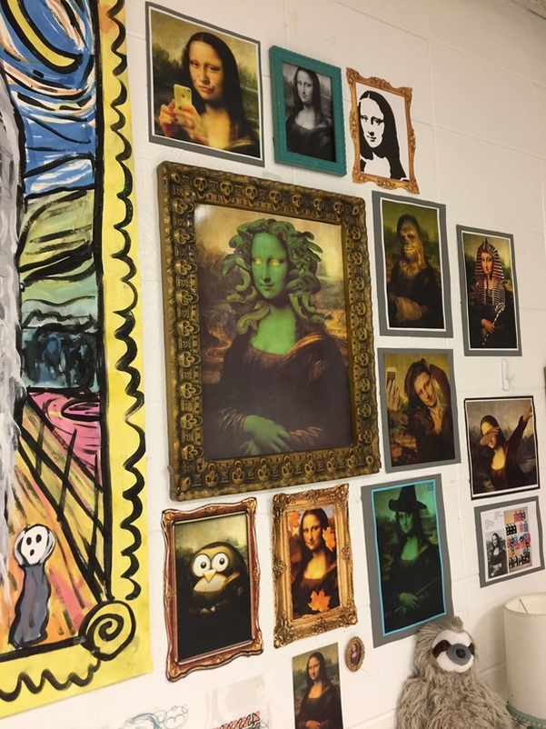
Since I am home on a snow day (yesterday AND today) I decided to update my blog. Wow. I have let a lot of great projects go undocumented. Part of the problem stems from the fact that I moved from K-4 in 2014 to a middle school. I now have 6 classes a day and WAY less time to blog. Another factor for some of the posts I am finally sharing never being shared is that we got new computers and I got a new iphone around the same time. That meant that a lot of stuff got backed up on an external hard drive never to be seen again. Until today. 

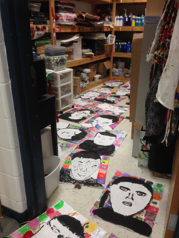
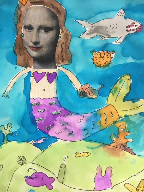
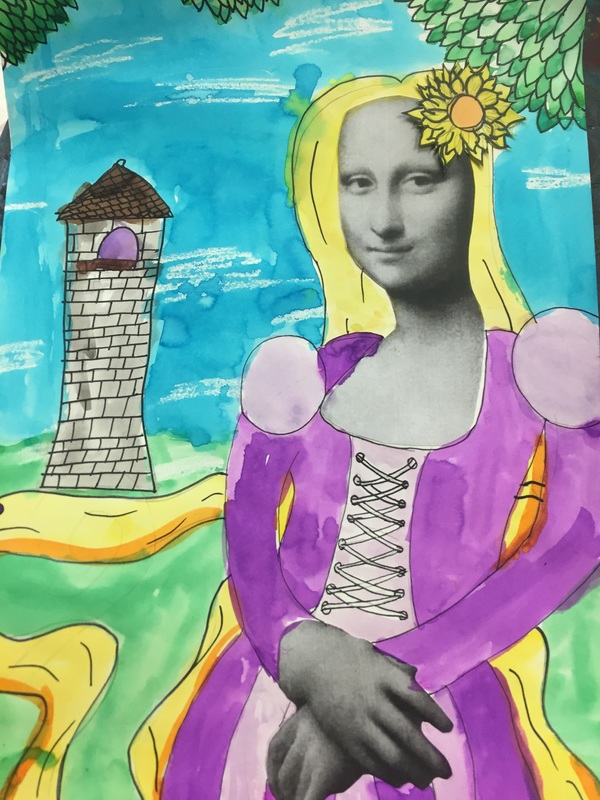
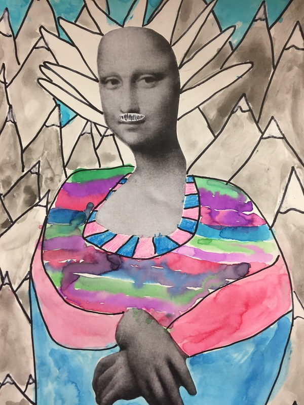
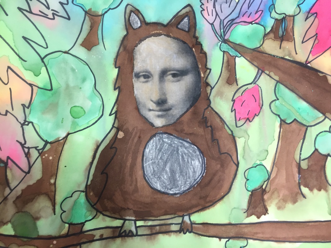
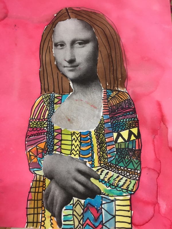
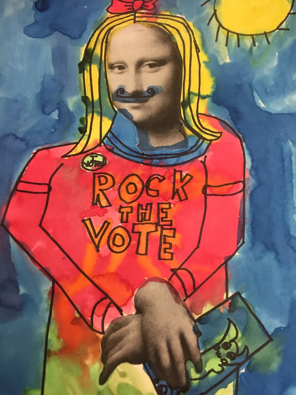
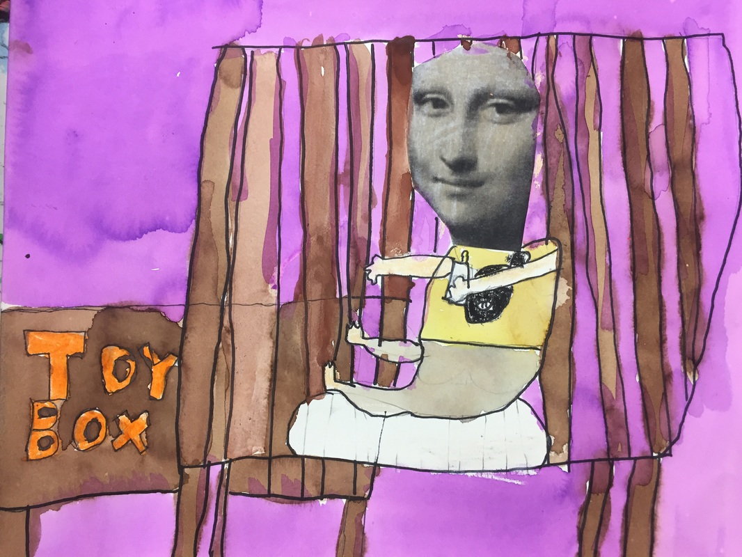
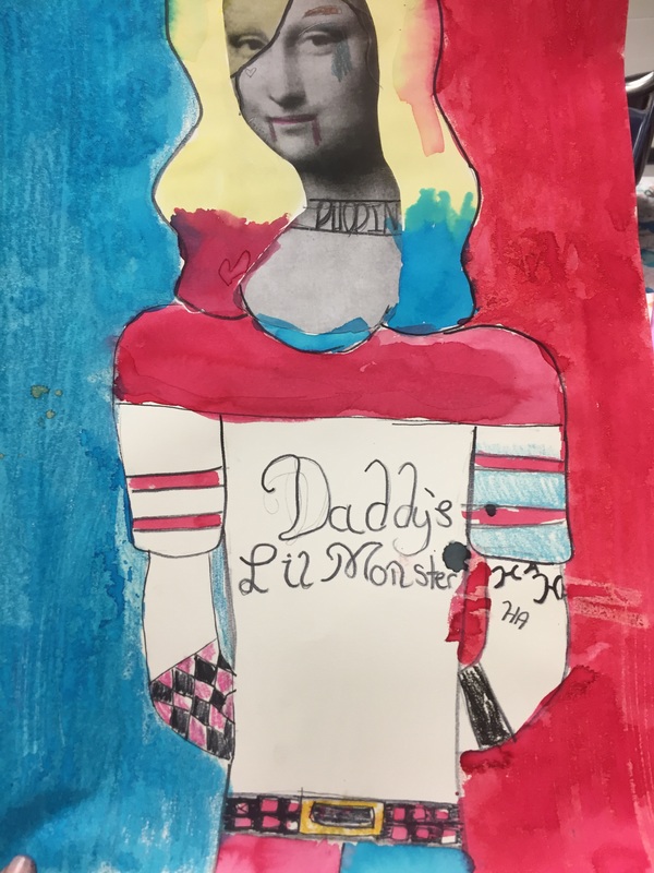
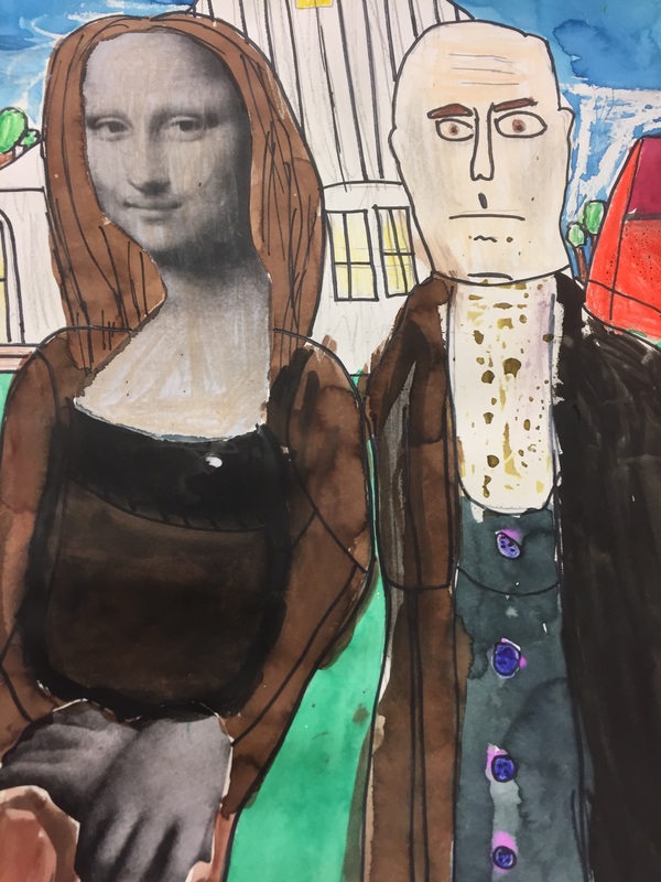
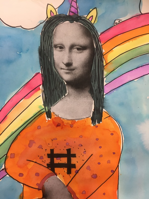
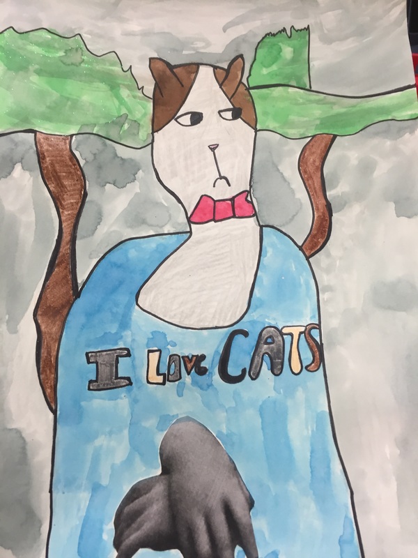
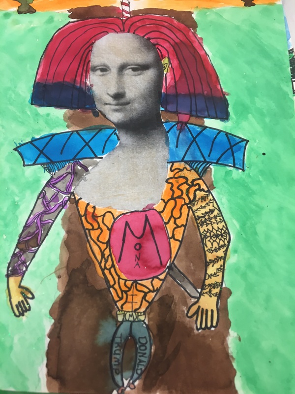
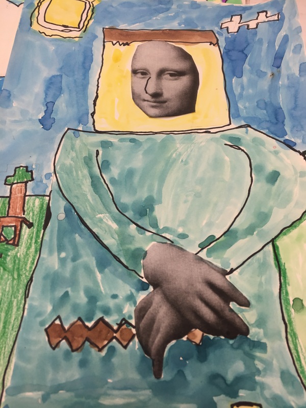
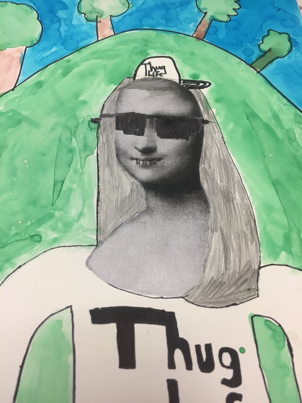
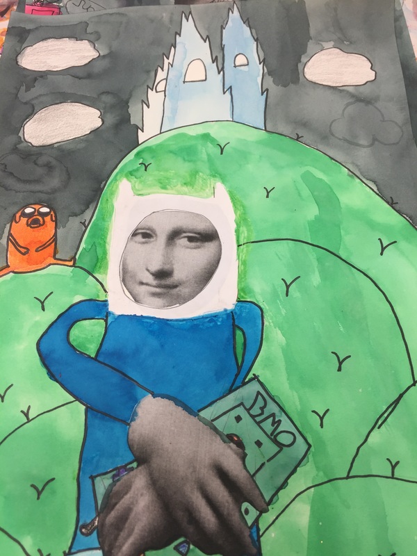
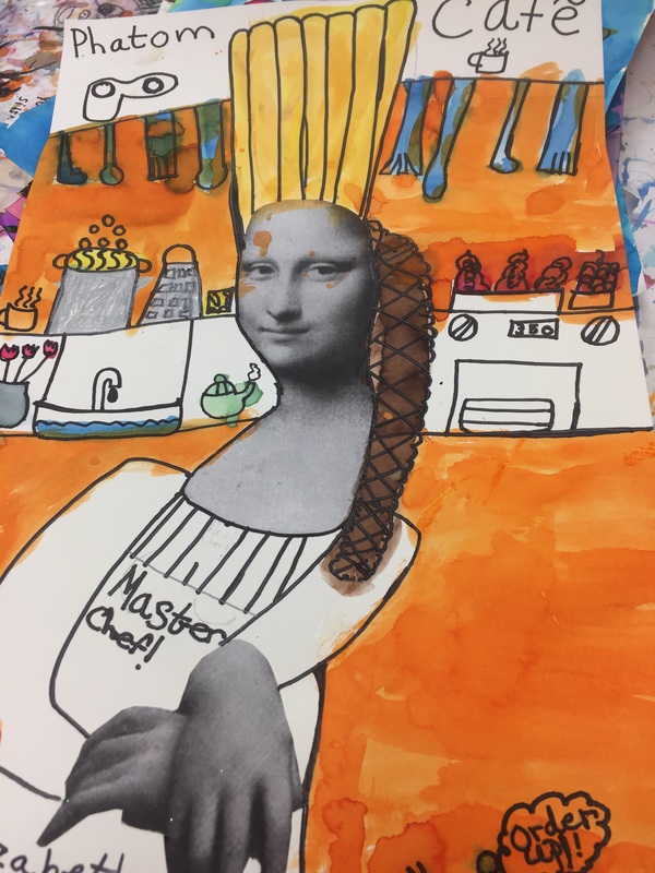
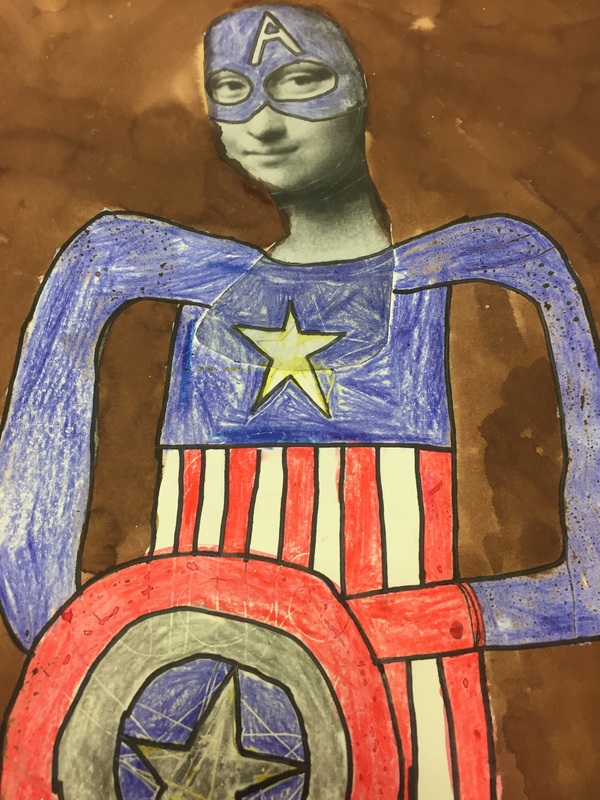
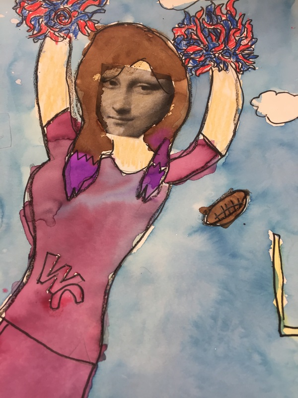
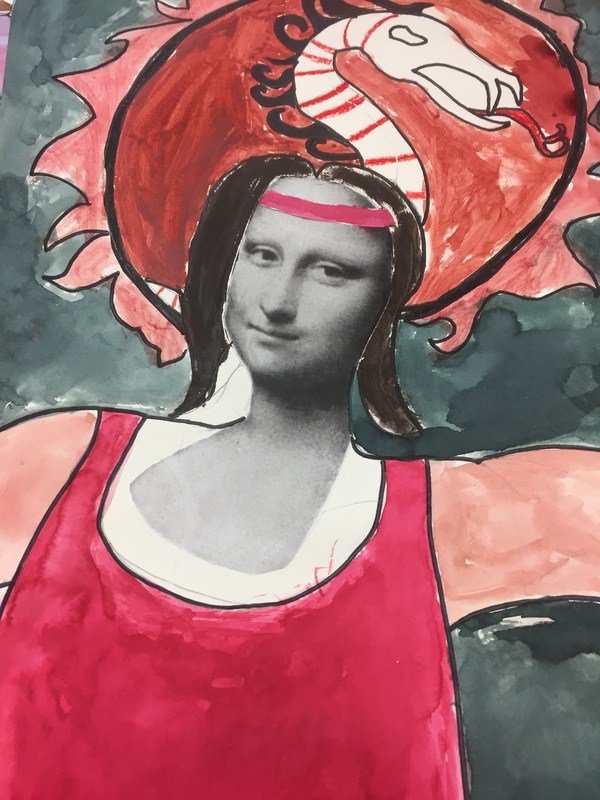
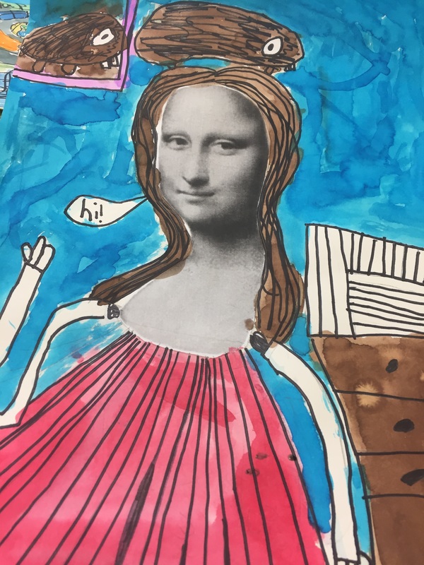
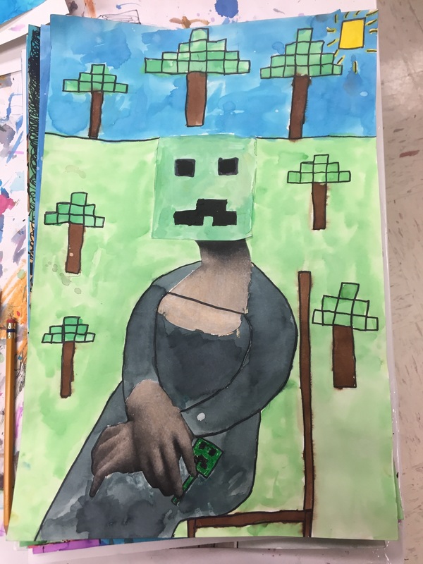
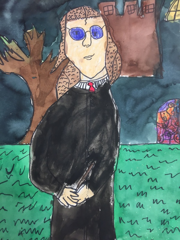
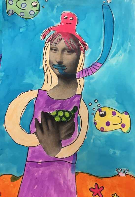
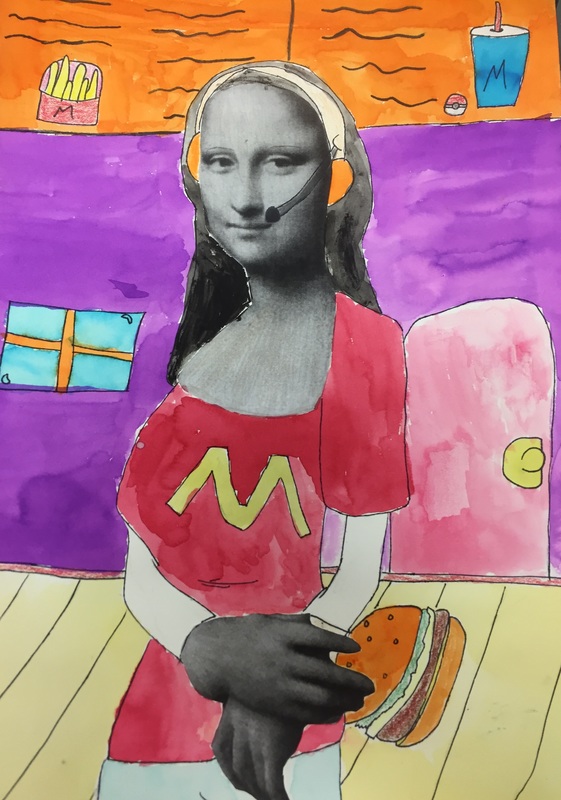
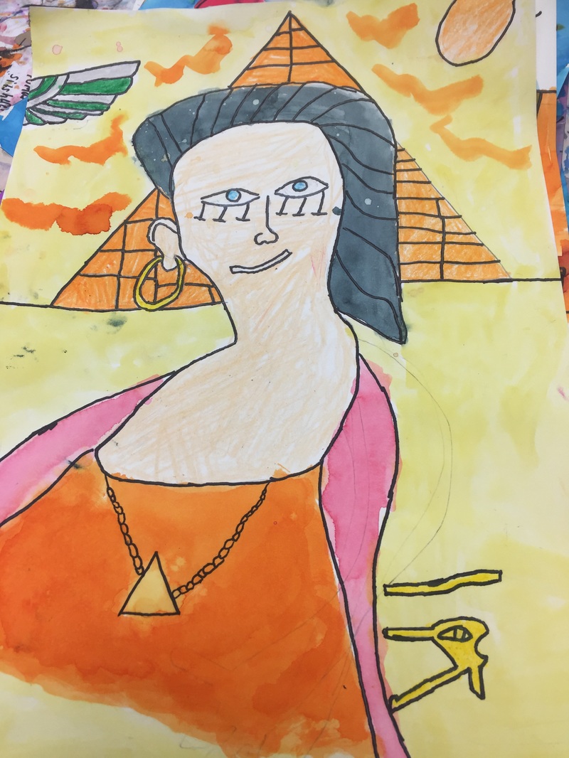
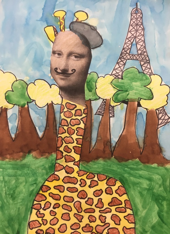
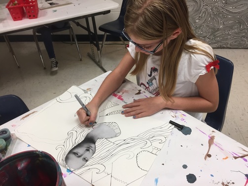
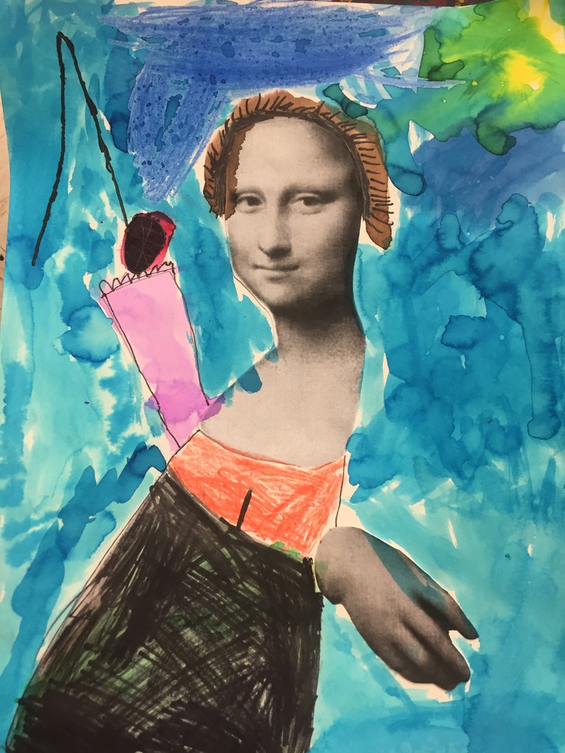
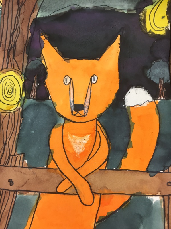
This is one of those stunning projects that was a huge 'WOW' in the cafeteria but I never shared it here. The portraits were 18X24, which meant they were a huge storage issue at the time, but since we did them at the end of the semester, it wasn't as huge of an issue. 

The lesson was almost completely taken from the blog Frecklephoto. She inspired almost every element, which is good, because there are many details I can't remember. More here. More here. And here. My students did this lesson in December 2014, and I haven't tackled it since. 
Picture
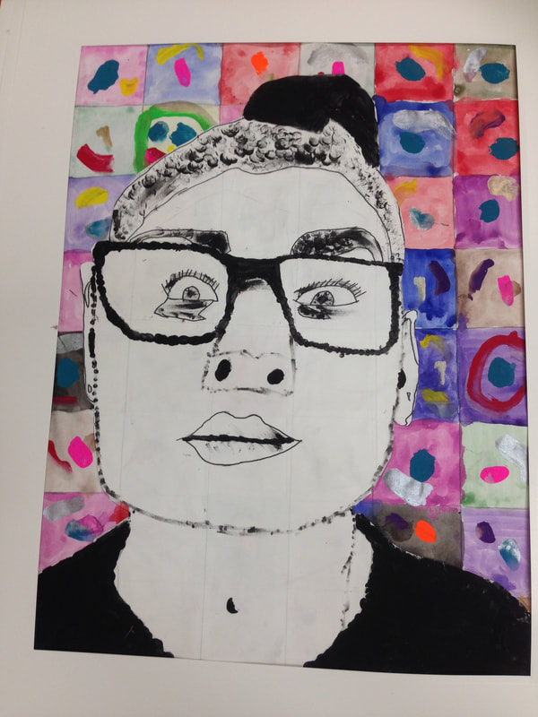
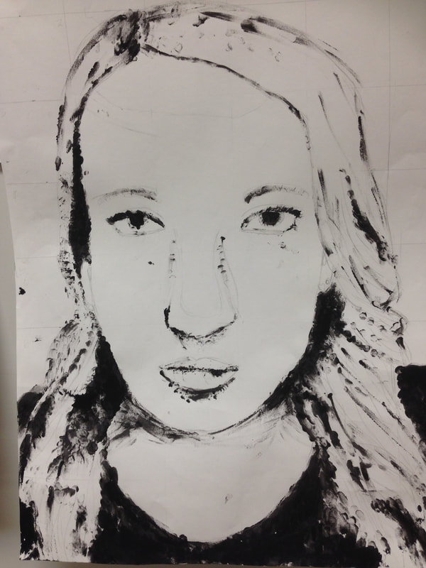
 From what I remember, I took photos of every student on an iPad and uploaded them on my computer. I converted each one to black and white, bumped up the contrast and printed them off so they were roughly 8X6 (I think). Since I took each student's photo, I encouraged them to look pleasant, not show their teeth and have their eyes open. We learned a lot about Chuck Close through videos and the images on my smore flyer. 

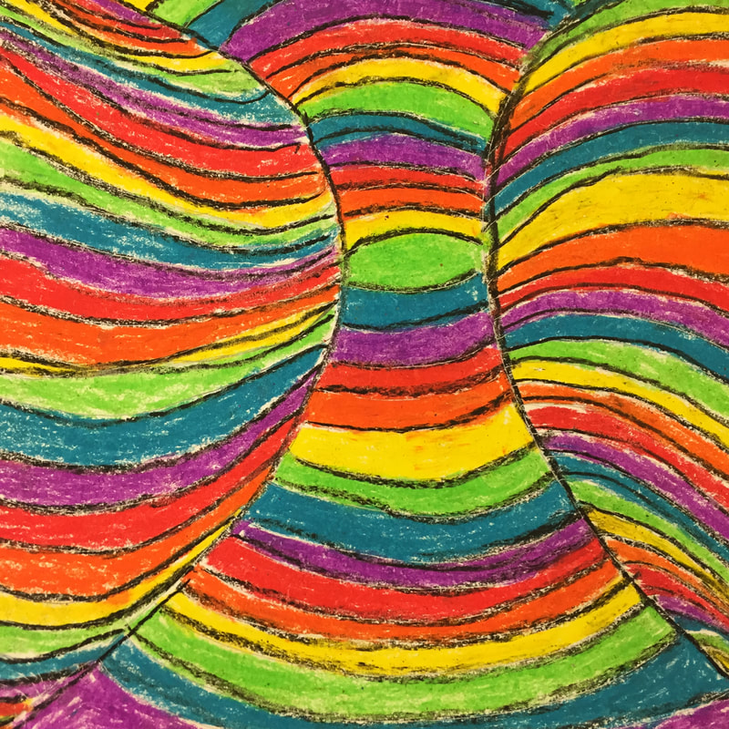
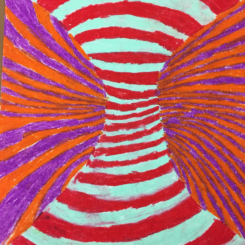
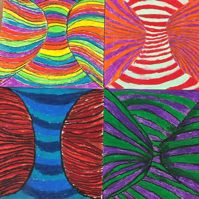
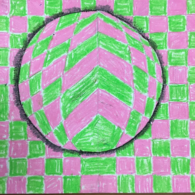
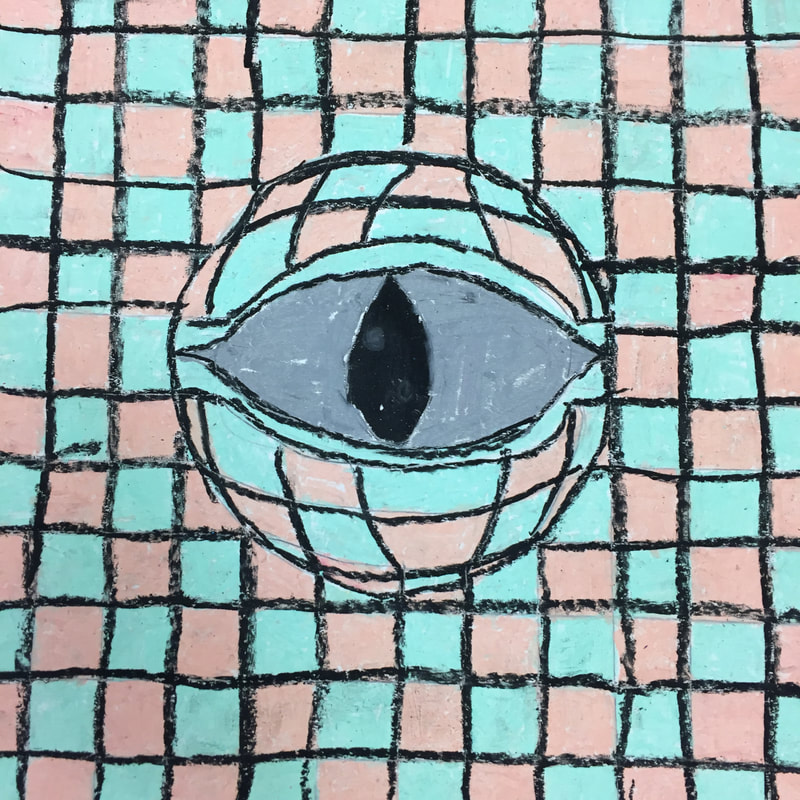
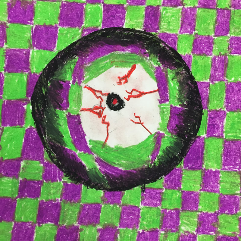
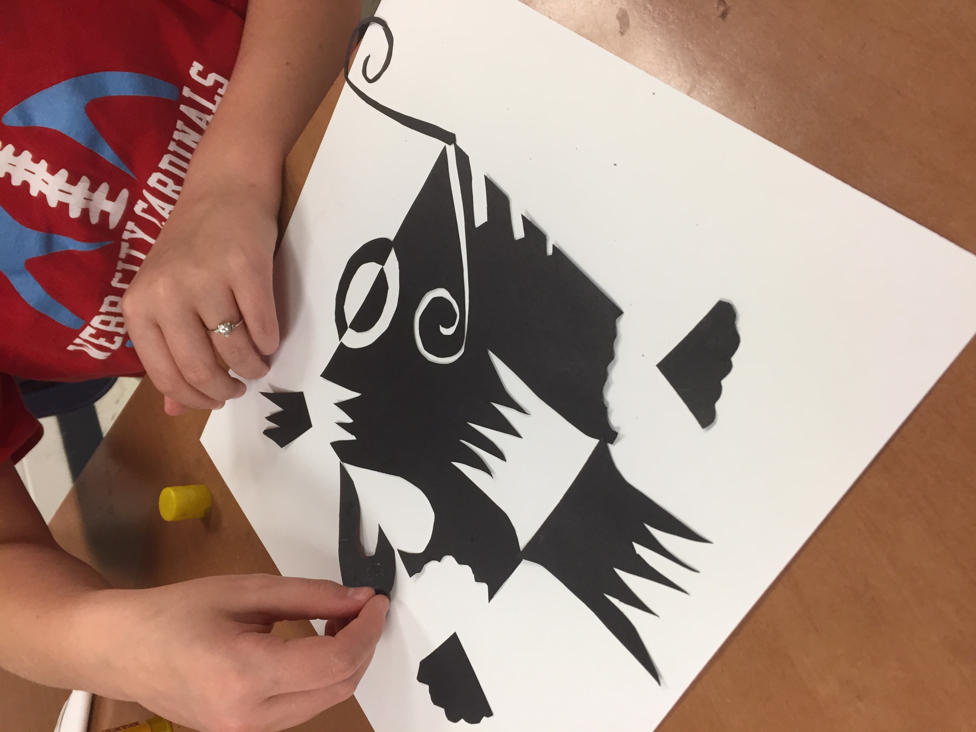
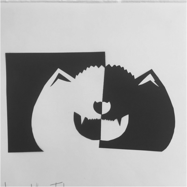
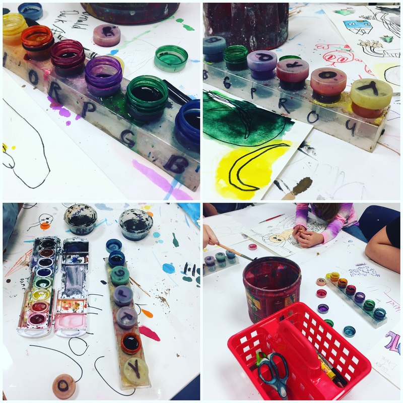
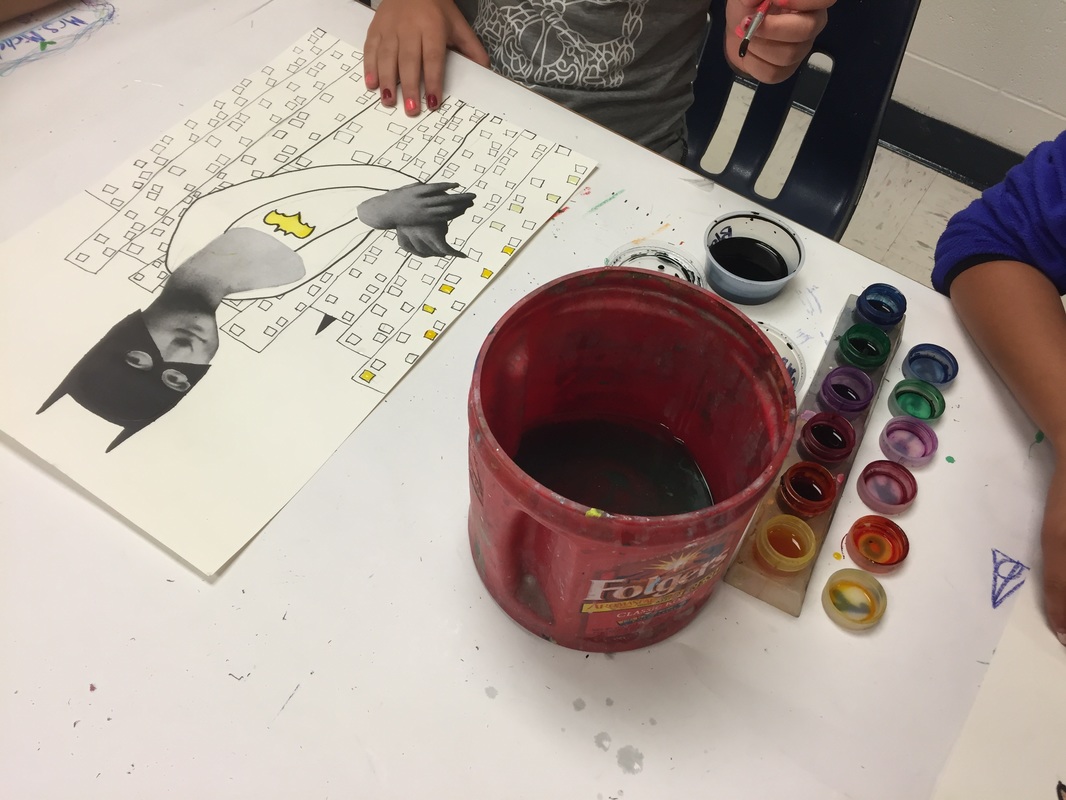
It was labor intensive before we actually started to get them all prepped. Meanwhile, students practiced grid drawing on a couple of worksheets. They also used the practice handout of the portrait to practice stamping different values with one finger. I made up my own based on the example on Frecklephoto, you will see it below. I will try to scan it and add to this post when I get back to school. 

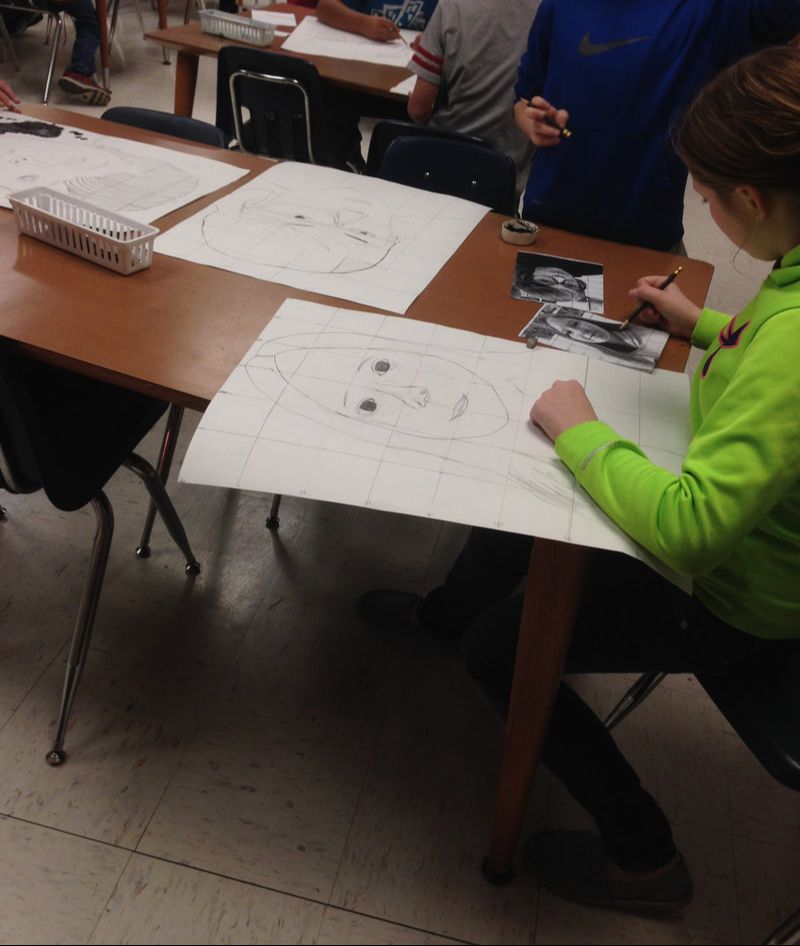
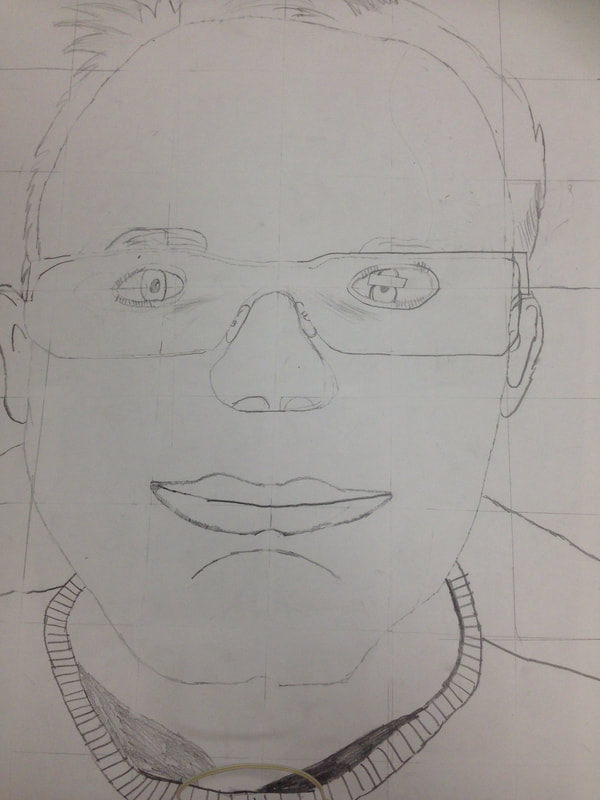
Perhaps the hardest part of the project was drawing their portraits using the grid drawing method. No. I take that back. Using a ruler was the hardest part. We had to use yard sticks because the paper was so big and lots of kids needed help holding it down to measure their 18X24 paper and then LIGHTLY trace the pencil lines with a ruler. This took two art days. Students also had to draw a small grid with a regular ruler on their printed photo so that it would correspond with the big paper. We had a really hard time erasing the pencil lines, as you can see from some of the examples....but all well. 

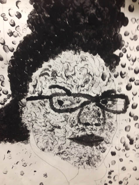
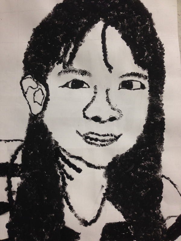
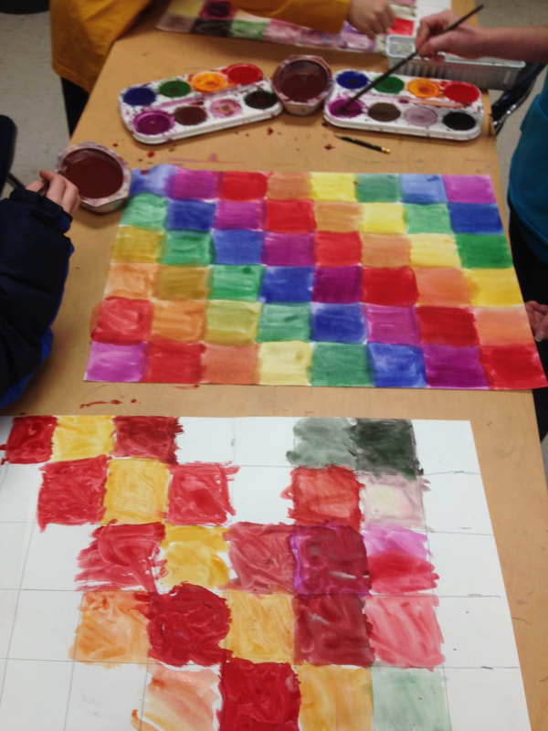
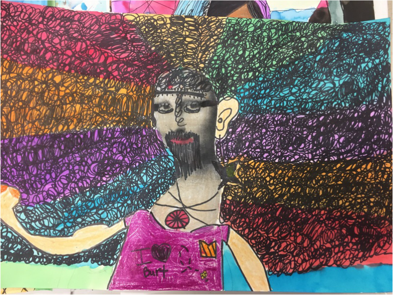
The finger printing on the face didn't take too long.....and for the background, we made a 2nd 18X24 grid and painted it with tempera cakes. We were rushed to finish right before Christmas break, so the last step was cutting out the portrait and gluing it down to the dry painting, or as some classes had to do, onto the still-wet tempera-cake paint. 

Before Project: Photograph each student, convert and print
​
Day 1 
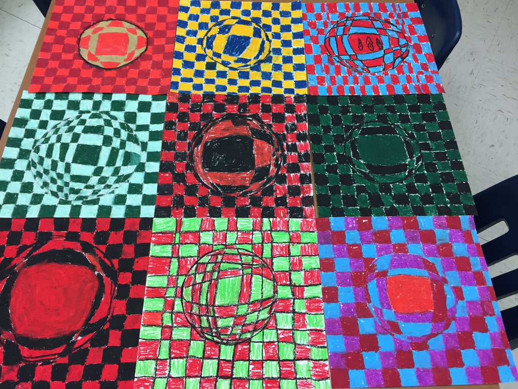
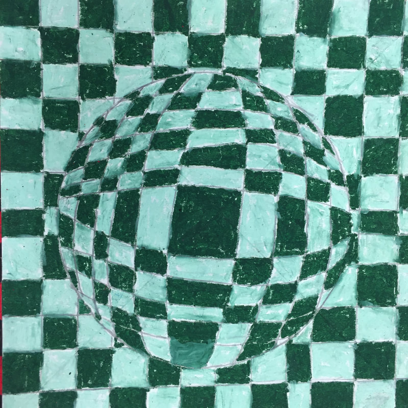
Learn about chuck close. Practice grid drawing. (elephant grid drawing)

Day 2
Draw grid on photo. Draw grid on 18X24 paper. I made a video to explain the grid drawing method. I could tell they were bored when it got to the big paper because it is hard to see my lines. 

Day 3
Finish drawing grids. Begin lightly sketching features on big grid using grid drawing method.

Day 4
Practice making values on handout with black paint. Make a value scale. 

Day 5
Catch up Day. Finish all grids, everyone finish practicing values. Finish sketching all faces on papers. Begin drawing grid on 2nd 18X24 paper. Name on it. 

Day 6
Fingerprint stamp 18X24 portrait. 

Day 7
Paint 18X24 background paper (some need to finish fingerprint stamping their portrait)

Day 8
Cut out portrait and glue it to the background. (Finish painting!!)

Supplies
18X24 paper (2 per student)
printed photos of each student
pencils and erasers
yard sticks
rulers
black paint
copies of practice portrait
tempera cake paint
scissors 
glue​
Picture
Picture
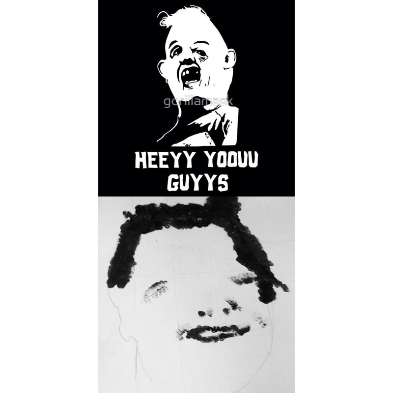
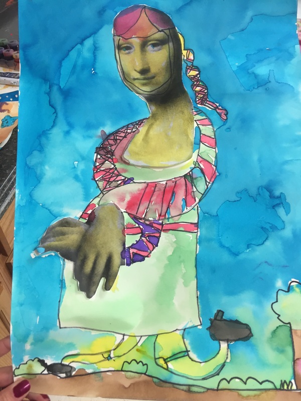
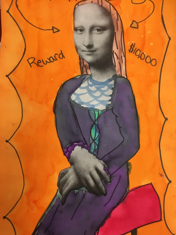
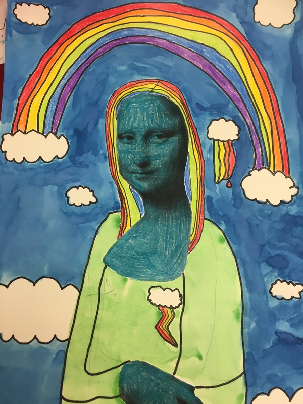
Seriously some of them were so bad, they were funny.
Picture
Picture
Picture
Picture
Picture
Picture
Picture
Picture
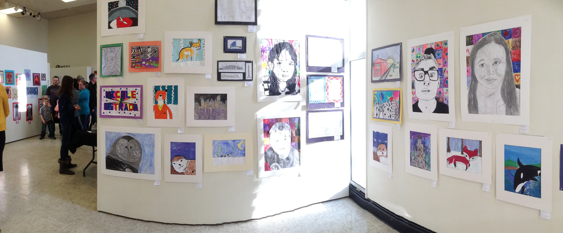
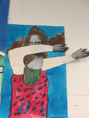
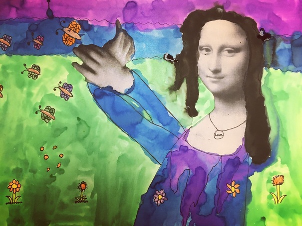
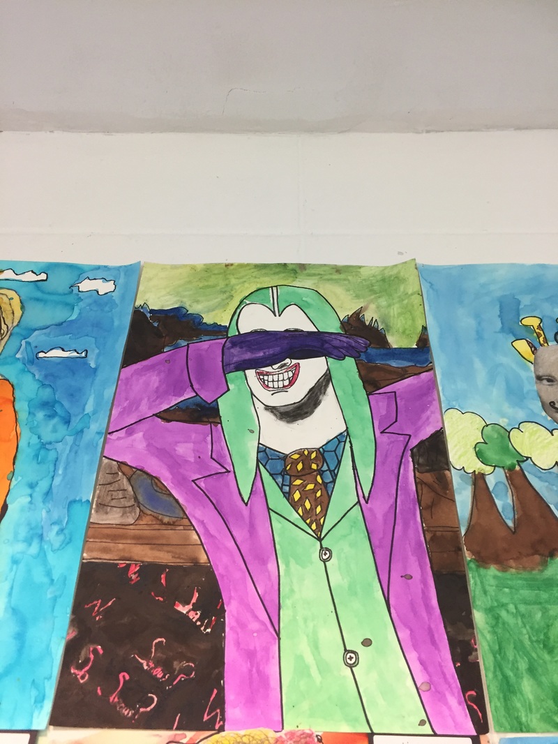
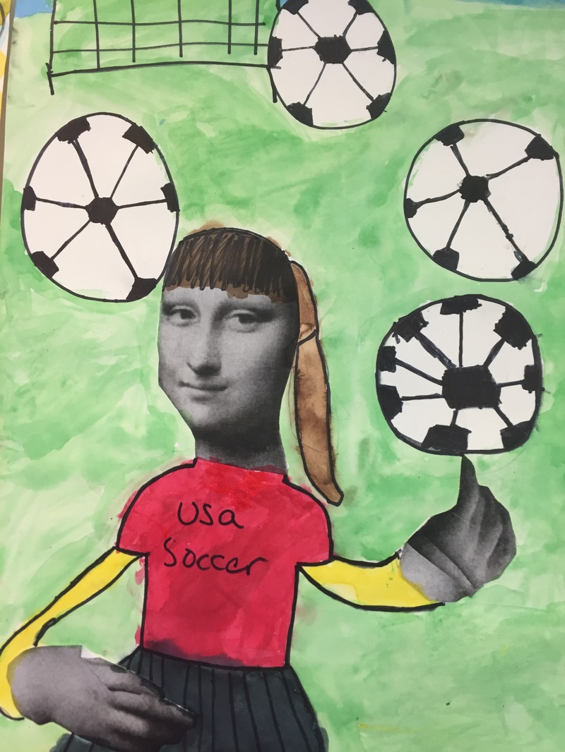
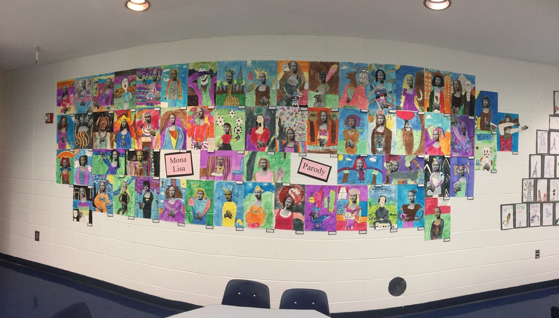
I have searched and search for more photos of the finished portraits or of the cafeteria display. Unfortunately, I cannot find any other photos of the student's work. I took 3 to an art show, but I think we had several snow days that year so I might not have photographed them in the school....bummer, there were some great ones. This project took up a ton of space but I LOVE having students work BIG. 
0 Comments

Optical Illusions

1/14/2018

1 Comment

 
Picture
My middle schoolers love optical illusions. Every year, students request an optical illusion project. Here are a few of my favorites:

​Op Art Ornaments
Optical Illusion Heart/Sphere in Chalk
Optical Illusion Sketchbook Covers
​

For a while, I have wanted to figure out a way to select an optical illusion project that is engaging for all ability levels. At first, I made a smore flyer and allowed my students to choose an optical illusion that they wanted to create from the examples I had provided links to. This did not work well because some students chose things that were too time consuming, or too hard even for me to figure out, OR to easy and not time consuming enough and they finished in one day while everyone else needed weeks. Also, since we had the ipads out, I didn't want to use oil pastels so we were limited to colored pencils or markers. 

For the examples linked above, everyone basically followed the exact same steps. So there wasn't much variety. When my librarian ordered Optical Illusions (How to Art Doodle) by Carolyn Scrace book, I decided that this year, I would make students choose between 3 designs from the book. All 3 were similar in difficulty level and everyone would make a 12X12 oil pastel design. (I was on a 12X12 design kick this year...students did like 6 projects with 12X12 paper!)

The book has rather low reviews on amazon.com, but I found it very helpful in showing my students the steps and giving them ideas. 

This project was really successful as it gave us the opportunity to talk about quality, and I could show examples of really good quality and not so good quality.....but it isn't a lesson that I want to tackle again anytime soon and I am trying to figure out why.....because the results were stunning. 

Picture
Picture
Day 1
We looked at some examples of optical illusions and talked about various optical illusion artists. I share a slideshow with examples by Bridget Riley and M.C. Escher and students are happy to see some familiar images they have seen before. I have one copy of the scholastic magazine about optical illusions which has a ton of great info about Bridget Riley, which is what I basically summarize for my students. When I start a new big unit like this, I always have tons of visuals around the room that students can use for inspiration. I would love to find an optical illusion calendar to cut apart because printing stuff on a color printer just isn't as vibrant. 

Youtube video list of optical illusion videos. 
10 Amazing Optical Illusions---I usually show this the 1st day

Students looked at the examples they could choose from and started practicing in their sketchbooks. 

Supplies:
Sketchbooks
pencils
erasers
circle templates
​rulers
Picture
Day 2
Once students had a small thumbnail sketch of their idea (and many realized it was harder than it looked), we started drawing in pencil on 12X12 white paper. I took some time to demonstrate how to use a ruler to make lines across the paper and then how to make a grid. I also did a few mini demo's on how to make some of the illusions a little easier. Students used oil pastels to start coloring their designs. I highly stressed that they should save black for last, as it smears badly and they should be careful with very light colors and white, as those get dirty easy. I discouraged them from using traditional checkerboard black and white because black is just so messy that I knew the white would get ruined on many of their projects.

Supplies:
Rulers
circle templates
12X12 white paper
oil pastels (no black)
​cover sheets for tables

Picture
Day 3
Those checkerboard designs were getting very tedious....even though it is argubly the easiest one to draw, it is pretty hard to color and it is hard to fix mistakes so kids have to be very careful not to mess up their pattern. I showed students how to add black and blend it to make their illusion pop just a little more. I showed examples of good quality and not so good quality and encouraged kids to work towards getting a '3' on their project. We also discussed craftsmanship and scribbling. With oil pastels, you have to color pretty firmly to get good coverage. 

This is the video I showed every class to demonstrate the blending. It isn't the greatest video, but I made 6X6 mini versions of the projects so I could demonstrate the blending technique quickly. I didn't want to have to make a sample for every class, so the video was very helpful!

Supplies
​Cover sheets
oil pastels plus black
pencils
​
Picture
She used navy instead of black to outline and I really like it!
Picture
This design idea came from a different book.
Day 4
Okay, today many kids were already done or close to being done with their optical illusions. I had a bunch of 6X6 paper ready and I showed them the 'ol oil pastel firework trick with an  eraser. They loved it! Thanks art of ed!

Supplies
Oil pastels
Old erasers (we used hard rubber erasers)
cover sheets
6X6 squares
Picture
Picture

Okay so this project had variety, quality control, a bonus free time extra fun project for early finishers, high level of critical thinking, ruler skills training, and a medium-level-mess-factor.

It wasn't the messiest thing, but it wasn't super clean and boring either.

Why am I not excited to teach this unit the same way again the same way?

Some students did not like the limited options.....they were annoyed that I didn't have MORE variety. Okay, I get that. But as it was, I still had to start each day with instructions specific to each design and tips that would help individual students. If a student had a good idea, I was open to letting them give it a shot. 

While the results of the project are visually very beautiful, I will have to think long and about what I would do differently in the future. 

One of my professional development goals this year is to focus on critical thinking and how I implement it into student learning. I feel like most art projects require tons of critical thinking. Even if there is  an existing 'recipe' like in this project, there is still tons of room for error and each product is different depending on how students used the materials, techniques and executed the process. By giving students tons of opportunities to make decisions about their finished product, they were using critical thinking. This isn't one of those cookie cutter projects where everyone's ended up looking basically the same, there is tons of variety and room for interpretation. 

MDQ 1.1 The teacher provides a clearly stated learning goal accompanied by a scale or rubric that describes levels of performance relative to the learning goal

In order to grade this project, I posted a visual 'rubric'. I pointed to the examples that would be considered a '3' and would meet all of the requirements for the objective. Then, we discussed what a '2' and a '1' would look like. The examples of each are in the photo below. It helped some students to see where they could improve their design even if they said it was done, many students were able to set a goal for improvement. 
Picture
4 examples of a '3' and an example of a '2' and a '1'. Quality control.
Picture
1 Comment

Crystal Bridges

5/23/2017

0 Comments

 
When a classroom teacher invites me to Crystal Bridges, I always jump at the chance to visit the museum. I love spending the day on the beautiful trails, in the beautiful facility, away from my boring old classroom. 
I love the guide that is provided to lead our group on the tour. 
Picture
Picture
Picture
Picture
Picture
Picture
Picture
Picture
Picture
0 Comments

Notan

12/6/2016

1 Comment

 
This project had a very high success rate and the majority of my students could finish in one class period. 

First, I handed each of them a handout (free on teachers pay teachers!) and had them read about the Japanese paper cutting.

Nōtan is a Japanese design concept involving the play and placement of light and dark elements as they are placed next to the other in the composition of art and imagery. I think I remember doing something like this in my Basic Design class in college. 

(My art teachers and I have been complaining about how hard it is for students to follow basic instructions when it comes to cutting and gluing, as the 'crafty' stuff has been phased out of regular classroom curriculum in recent years, they have less and less exposure to the basics).

This project helps them to visuals how to cut something and then flip 'half' of the shape, exposing the negative space. I also like it because they don't have any scraps, they use everything that they cut out. And it isn't seasonal, it can be done any time of year. 

Supplies:
12X12 white background paper (I also had red/green)
6X6 black paper (I also had red/green)
scissors
colored pencil for drawing
glue sticks
After reading and discussing the handout, we watched a little video which really helped them understand how to do this. The artist in the video is using some sort of weird glue, so they were a little baffled by that. I told them to make sure they use glue sticks so they don't have a gluey mess on their tiny little cut outs. I also had a few envelopes so they could save tiny things for next time if they didn't get everything glued down. 

In the future, I could combine this with a lesson about Matisse. 
Picture
Picture
Picture
Picture
Picture
Picture
Picture
1 Comment

Mona Lisa Parody

11/13/2016

0 Comments

 
Picture
PictureDabbing Mona Lisa
For this project, I was looking for a way to infuse more art history into my curriculum and also a chance to use liquid watercolor.

I already had a parody of the Mona Lisa 'dabbing' above the regular poster of the real painting and my students were pretty much obsessed with it. 

When I found a few reference posts on pinterest, I decided to tackle a Mona Lisa parody project with my students. 

I printed off this head and hands template from Art Projects for Kids. 

Throughout the unit I shared facts from this list.

And since everyone loves a good whodunnit, I started the whole unit off with the mysterious story of the stolen Mona Lisa. Prior to the first class, I took down my Mona Lisa poster and left a small white sign that declared the missing/stolen Mona Lisa.

I did not hang up any pictures or images for inspiration, I started with a story of the missing painting. If you are looking for a good version, I read the one page story for the first  few classes, but after that, I basically had it memorized. Here is another one you could copy and have your students read. 
 
After learning how the painting was stolen and then recovered, I explained that it elevated the painting to THE most famous painting in the world. As a result, other artists started to make funny versions of the painting called parodies. I showed them a bunch of examples of parodies of the Mona Lisa. 

Parody--​an imitation of the style of a particular writer, artist, or genre with deliberate exaggeration for comic effect.

Picture
Mona Lisa releasing butterflies
Picture
PictureFlash sits below the sloth Mona Lisa parody painting

After explaining what a parody is, I realized that there are many instances that arise in cartoons or movies in which references are made to famous songs, works of art, etc.

​Many times, students don't have the background knowledge to 'get' the joke. So I decided to enlighten them with a little game called: Parody or Real Thing. Some students recognized these images immediately because they had seen them in a previous class or I had showed them last year.

Other images, they had never seen before, so I quickly gave them a mini art history lesson about the painting, artist or time period. It was a way to get the info in really quickly. I used a slide show for my initial introduction of the game, and then had them say out loud, what they thought---Parody or Real Thing. 

I showed them the Parody or Real Thing slide show after the initial introduction of the project. That same day, I introduced my Mona Lisa inspiration wall. I painted a big 6ft tall sloth in the Mona Lisa pose, with a Starry Night background---this gave students a lot of ideas on how they could incorporate other famous paintings as a background or they could reference other works of art in their parody to make it more interesting. 

Later, I made a kahoot quiz to make the game more interactive with all new images.

I LOVE Kahoot---I had a few issues the two days I tried to implement the quiz. First of all, the internet was almost non-functioning. I wasted several class periods just trying to get everyone logged onto devices.

Second of all, it is SUPER interactive, when the game was functioning, most kids were so amped up from the excitement, it was hard to get  a word in edgewise, which was why I was attempting to play this on our early-out day on Halloween. It perfectly aligned with our unit and the kids really enjoyed it. 

Rainbow background with starbucks
Mermaid Mona with her shell phone
Albert einstein
Love the legs on this one!
T-Rex Mona---He just ate her so you can only see her hand.
Cheer leader
Mortal Combat
For the actual design, we used 12X18 watercolor paper. Students could choose to use the actual photo copy of her face and hands, or they could attempt to draw her on their own. They could use just the face, or just the hands, but if they decided to do another character, then it either had to be in the famous 'Mona Lisa' pose or it had to have the same background, or else it wouldn't be a parody, it would just be a painting of Batman.

I really liked it when they realized they could customize her hair or they could cut out scraps of paper to make a partial mask or sunglasses. I told them to use the white paper around the photo copy for 'props' or practice sketches.

We used a glue stick to glue the cut-outs down, and we drew everything in pencil and outlined in sharpie first. 

Supplies:
12X18 Watercolor paper
Pencil and eraser
sharpie
liquid watercolor
crayons
regular watercolor
Picture
I decided not to hang up very many of the scary clowns since several of my students are scared of them.
Obviously the election and scary clowns were on everyone's mind in September. Also featured frequently, pokemon go, snapchat filters, and superheroes. 
Picture
Trump is dabbing. Lots more Trumps than Hillarys.
Picture
This girl can draw a horse any time, any where. She is amazing.
Picture
A deer + Leaning Tower. This kid isn't afraid to try to put stuff in his art that other kids say is 'hard'.
Picture
Some were confused by the fact that the copy I gave them was completely bald--they had to at least add hair. And maybe arms and a shirt. I only gave them the head/neck and hands. Some added the hair perfectly. 

Picture
I had a sub one day, and when I returned, this table of girls had created an assortment of wild hair styles. This was my favorite.
Picture
Sloth Mona Lisa. Ties the unit to previous units this year.
Picture
I think the medusa Mona is from Oriental Trading company.
Picture
This girl has had a shark in every single project for the last two years. I kind of love it.
Picture
A little pop art---I had a 'spare parts' bin where students could rummage around for extra heads and hands.
Picture
How clever is this boy to do a #nailedit meme as his Mona Lisa parody. I just love it! He wrote 'When I Created The Mona Lisa #nailedit' in the background. 
Picture
The liquid watercolor containers that were left in my classroom by a previous teacher worked out wonderfully for this project. They did not have brown or black so I opted for little plastic containers of brown and black, and I also provided regular watercolor sets for a jet black as the liquid watercolor was good for a dark sky, it wasn't good for Batman's suit---it just wasn't a dark dark black, it was sort of blueish. 
Picture
I encouraged my students to draw the background, outline everything in sharpie and erase old pencil lines. Also, I TRIED to stress that they should color SMALL details, like the yellow windows on this building with CRAYON before painting---to make it a wax resist. Some did not listen and had the headache of painting all the tiny windows and then trying to paint around them once the yellow dried. 

The first day of painting, I showed them a video I had made, where I demonstrate the wet-on-wet technique AND I explain how wax resist works. It was nice to have the demo recorded so I could show it to all 12 classes. 
Picture
Playing tetherball. I just love this one so much!!
Picture
A foxy Mona Lisa
Picture
Throughout the project, I had a drawing center set up for students to study statues that I have of the leaning tower of Pisa and the Eiffel tower. For this drawing station, I encourage them to blind contour as much as they can and use only felt tip drawing pens so they can't erase.  If they made something they were proud of, they could color it and glue it to a frame--names and class codes on the front---and I selected a bunch of them to hang up. Some made cute parodies of the Leaning Tower after I told them a little about it. 
Picture
Picture
A Mona Lisa for the Modern Age
Picture
It's my party ya'll (We are from the south!)
Picture
The joker, dabbing, with a Mona Lisa background---why so serious?
Picture
Such a great use of the hands!
Picture
0 Comments

Statue of Liberty Unit

8/7/2015

0 Comments

 
Several years ago at a conference, I was inspired by a Statue of Liberty Unit that another art teacher had done with her middle school students. I had a copy of her visual packet (it did not copy well so I ended up borrowing images and using books to show most of the visuals) but little else for the unit. The theme of our summer school this year is 'History of America' so the Statue of Liberty was a perfect topic. A couple of years ago, we had the same theme and I focused on Abraham Lincoln, this year I wanted to pull out that packet and my notes from the conference and develop it into something really great. 
Picture
Day 1 
The first day I introduced the project, I told the story of Professor Laboulaye and Bartholdi and the French gift with great symbolism. I told my students how sad it was that Bartholdi is not a household name like Van Gogh and DaVinci, considering he designed one of the most famous statues in the world. We read through the Discover Kids Magazine: Statue of Liberty as a class, and talked about some of the really important photos and key terms about how the Statue was built. Coincidentally, June 17th marks the 130th anniversary of the Statue entering the New York Harbor---it was fun to talk about that date with my classes that week. After reading through the magazine for about 30 minutes, we took a Kahoot quiz over the information using my iPad minis---this helped students retain the information also gave me a chance to go over the rules about using iPads in my art room. Here is a link to the Kahoot Quiz. 
Picture
Day 2 Today we started sketching ideas for a Statue of Liberty inspired painting. Students could honor the symbolism of the original artist, or they could inspiration from examples by Peter Max---American pop artist, who paints the Statue of Liberty every 4th of July OR Romearo Britto---and his red-white-blue painting of the lady liberty entitled 'Freedom'. I encouraged students to draw 3-4 versions on a piece of 9X12 paper, we folded it into 4 squares so they would have lots of practice spots. Once they had settled on an idea, they needed to transfer it to 12X18 colored construction paper. This was a great way to use up those faded, old pieces of construction paper. I encouraged them to draw BIG and LIGHTLY and make sure to add a background. Once their drawing was sketched on the big paper, they were ready to paint. Not everyone was ready on day 2, so I encouraged early finishers to use modeling clay to make their own Statue of Liberty for fun! Some students wanted to focus on the torch, instead of drawing the face----I let them do that in this project, but if you were focusing on the portrait you might want to be specific about your expectations. 

Picture
Day 3 For the first day of painting, I encouraged students to paint the background first. I always do this with bigger paintings, because they tend to jump right to the main subject and neglect the background....but by painting the background first, they are forced to plan it out in advance, and it helps them to finish everything on time! One big thing----if they decided to paint fireworks or lots of small stars or something like that, they need to either choose a background color that works (like purple or black), or they need to paint the entire background before starting on the tiny sparks of the fireworks. Several students ran out of time because they started with the fireworks and then tried to paint around each little 'dash'. Once the background base layer is painted, they can mix up a special 'green', or paint the 'skin' of the statue however they want. I encouraged them to save outlining and small details like the eyes, nose, and mouth for the next day so that the base layer could dry properly. 
Picture
Day 4 Final details! Today was our last day for painting so I brought out the silver, gold, and copper metallic paint so students could give their painting a little sparkle! This was a great chance to jazz up the background with fireworks---I showed an example of how to paint them with a thin brush using lots of dashes and small lines. I also think these paintings look great when they are outlined in black paint---so I encouraged them to either use a small brush with black paint, or at least go back and draw the details on in black sharpie if they painted right over the eyes and nose last time. 

NOTE: One girl who is a GIFTED artist, was struggling with this project. I know that she is really good at animals so I said, 'You could just use the statue's pose as inspiration....and make an animal' instead!' She came up with the OH-SO-CUTE cat below! She spent so long drawing it that she ran out of time for painting---she colored hers with construction paper crayons instead. I LOVE IT!
Picture
If you are considering this unit, check out my PinBoard with lots of visuals and ideas!
Picture
Picture
Picture
Picture
Picture
Picture
Picture
Yes, I do hang up a few 'line' drawings of coloring sheets and even a few step-by-step drawing tools---especially on a project we only have a few days to work on, it helps them stay on track and get done on time so that they aren't spending a lot of class time 'figuring out' what to draw....I also have lots of books, visuals and examples by artists for inspiration. 
Picture
0 Comments

How do you curate student work?

9/20/2014

0 Comments

 
Curating student work is a big job.

Between art shows and building displays, the act of setting up all of the displays is an incredible undertaking. Just the act of selecting a few pieces for a show can be really difficult.

Generally I don't really work on-on one with my students to determine what will be displayed. I usually just sit down and
sort through pile after pile of artwork, taking in to consideration themes, color choices, paper orientation, size of my bulletin board, and how many pieces I have selected from that student in the past. I make selections methodically, with an idea in my mind for the final layout of the display.


Picture
Picture
Recently, I collaborated with a professor friend to organize some student work for a show at her university. The deadline sort of snuck up on me and I had to squeeze the project into the middle of a big unit. The lesson plan was ready-made, it was just a matter of cutting the paper and getting the supplies organized.

It worked out great because I had the chance to introduce my students to the artist of the month: Henri Matisse. (Students read and view the information on a S'more flyer that is accessed via QR code).

I was also able to try out Emaze. Instead of creating a Powerpoint, I created a slideshow on Emaze. I synced my apple tv to my computer with air parrot, so that I could use the cool flash-only template: gallery. I had the slideshow on repeat throughout the entire lesson so students could read and see about the artwork continuously.

I followed the lesson plan pretty closely, demonstrating how to cut out an organic shape, using that free 'painting with scissors' sort of style that Matisse is famous for. While students were working, I allowed them to 'jazz' up the adjoining hallway with organic shapes taped to the walls. They really enjoyed installing their piece to the collaboration. It was a fun experience. When I asked the teachers who work down that hallway if I could use the two walls for my installation, I'm not sure what they were expecting....but I think they are a little creeped out at the results...art people get it....others kind of don't.....but that is okay. It was especially cool that the music teacher down the hall had jazz music playing while we were installing the installation....again, only an art teacher would appreciate the perfection of that sound while we were taping paper scraps to a wall.

Picture
Here is the hallway 'before'. I chose this hallway because it doesn't get a ton of traffic, and students who use the busier hallway (with the creepy Cardinal eye peeping out), can get a peek at the installation.
Picture
Picture
Picture
From the collages that were created during class, I selected around 30, out of 330 to go to the exhibit at PSU. When I told students whose I had selected, some of them were bummed that theirs was not selected...so that always make it harder!

How do you curate student work?


This post is part of the Reflective Teaching Blog Challenge from TeachThought.
0 Comments

Day 9 Write about one of your biggest accomplishments in Your teaching that no one knows about (or may not care)

9/9/2014

0 Comments

 
Picture
Ah, the Vikings. I love teaching about how the Vikings mastered the sea, navigating vast expanses of open sea without compasses, satellites, or radio communications. Their skillfully crafted wooden ships could take them anywhere. This little Viking ship postcard is just one visual that belongs in a packet of images related to Celtic and Viking art.

It is amazing that I can successfully navigate the makeshift filing system of artifacts and visuals located in the below a little school house in my district. The storage room, to a few art teachers I work with, is known lovingly as THE BASEMENT. It is smelly, damp, buggy, and crammed with boxes, foam trays, egg cartons, posters, you name it, we probably have it in the basement. It doesn't have an electronic filing system and the selves aren't labeled with fancy shelf markers. Quite frankly, it is a haven for cockroaches, the Grand Budapest Hotel for those crunchy critters to hide in the cardboard and foam.
Picture
To access THE BASEMENT, one must first descend a treacherous staircase, arms loaded with boxes and packets and files. It is much better if you can experience this your first time when the stairs are icy. At the very least, you must visit when it is a 110 degrees, as you press your armload of supplies against yourself and fumble with the keys to unlock the padlock. When I go at night, I'm always afraid that the Basilisk from Harry Potter will pop out of that little drain in the ground while my hands are full and I am trying to unlock the lock. At the very least, I am afraid of a black snack, curled up in the leaves in the corner will slither over while I am trying enter the basement, and I will be too afraid of its little army of baby snakes hiding in the leaves to go into the storage room.
Picture
This room has not been cleaned for many years. Another teacher and myself, spent a couple of hours last spring hauling out piles of old boxes and dried up paint that had come to live amongst the clutter. As disorganized and chaotic as this looks to a layperson, I can assure you that Leslie and I can determine exactly where a little postcard of a Viking ship should reside, and we can file it the correct spot, in a matter of just a few seconds. Whenever we go to the basement, it is a quick IN and OUT sort of trip. Grab what you need and bolt.
Picture
Picture
This location is a great place to keep colored sand for sand painting, a box of old shoes for shoe printing, extra plastic buckets for making paper, shells, bubble wrap, all the junk that is helpful once in a while, but you just don't have room to store in a classroom. I can't imagine NOT having a place to put all of these big packets full of visuals and samples. When I traveled between schools, it was so nice having a neutral location for these things so that I didn't not have to wonder which school they were housed, they were at the basement.

To most people, this room probably just looks like a giant junk heap. But I can't imagine teaching art without access to all of the stuff that is stored down here. It might look completely unorganized, but once you learn the system, the room is filled with treasures (ahem, to an art teacher). And you might argue that this room is really Leslie's accomplishment, and I am just her little understudy in the basement of wonders, but I have my own little corner, filled with all kinds of great things too.

Where do you store all of your random supplies? Do you have to scavenge for every project or is there somewhere that you keep stuff like this?

0 Comments

Did Picasso invent mine craft?

2/25/2014

0 Comments

 
Picture
Last month, while introducing the January 'Artist of the Month' a student asked an interesting question. Did Picasso invent Mine Craft?

Using my best VTS questioning skills I responded, 'What do you see that makes you ask that?'

He pointed to a large reproduction in my classroom of the Three Musicians.

Brilliant! The student had connected something in his real life with a work of art that he might not otherwise have made a connection with, and I explained his connection to all of my other classes and related the work of art to students in a completely new way.

No, Picasso did not invent 'mine craft' but in what ways is this work of art similar to your game?
How are Cubism and Mine Craft visually similar?
In what ways are the two things different?
Think-pair-share: Find someone in the room who is an expert on Mine Craft. Ask them to explain the concept of the game. Find someone in the room who is an expert on Cubism. Ask them to explain the concept.


Higher order thinking to the max!

From that point, students were directed to design a collage based on one of three of Picasso's ideas: a guitar, another instrument, or The Three Musicians. I encouraged the Mine Craft lovers in my school to use their game as a visual reference if they wanted to recreate the Three Musicians.

Students had to work with a partner to design their work of art by sketching and coloring a small version the first week. On week two, they had to make a large 18"X24" collage of
their sketch. Both artists had to give input on the design and both had to work on the collage to make it look neat and well-crafted.

Some of the designs came out more 'Mine Craft'-centric and a little less 'Picasso' influenced, but it was a fun activity and it allowed students with an interest in a video game to incorporate it into our classroom. Also, some of the students felt more comfortable drawing a figure as a 'cube' like a mine-craft musician than if they had to draw a guitar or other instrument, so it gave that element of variety and confidence to many artists!

Picture
Picture
0 Comments

Pablo Picasso Inspired!

2/4/2014

1 Comment

 
Picture
Picture
Picture
As a tribute to Pablo Picasso, our Artist of the Month, we created these 18X24 chicken paintings in 1st grade.

I demonstrated how to draw the chicken step-by-step on the big white paper using black oil pastels.

In their egg-carton pallets (shared amongst about 4 students per table), I gave them red, yellow and blue tempera paint and a brush.

First,
we painted a few things yellow...then we mixed with red to make orange...then we used straight red....(we didn't wash our brush between these hot colors). Remind them not to use all the yellow, we will need it for green later!!

I demonstrated and painted right along with them, on my own version at the front of the room.


THEN I let them wash out their brushes before we painted with the cool colors.

Blue on the rooster first; then we mixed with yellow to make green. Finally, we rinsed our brushes and made purple, mixing what was left of the blue and red.

Then they could finish off the painting with any colors they wanted, I just told them not to mix every color together (it would make gray).

Last, I squirted white into their pallets and allowed them to experiment with tints to finish the background.

Finally, when the paintings were done, we used oil pastels to 're-draw' some of our mistakes and add a bit of texture on the feathers.

Picture
***Edit: I had a comment requesting a step-by-step example on what I demonstrated for the drawing. At the front of the room, using a black oil pastel, I drew a big 'candy cane' for the top of the head. Most kids could do that pretty good. The paper was 18X24 so it is much larger than anything we normally use! From there, we added the face and details, adding the body and legs and tail at the end. My quick sketch above illustrates the basics. Hope this helps!
1 Comment
<<Previous
    PictureWelcome!

    Mrs. Mitchell

    Art teacher from Missouri. 

    Instagram
    Add to Flipboard Magazine.

    Archives

    March 2021
    April 2020
    November 2019
    July 2019
    April 2019
    January 2019
    October 2018
    July 2018
    June 2018
    May 2018
    April 2018
    March 2018
    January 2018
    September 2017
    May 2017
    April 2017
    March 2017
    January 2017
    December 2016
    November 2016
    October 2016
    September 2016
    March 2016
    December 2015
    October 2015
    August 2015
    May 2015
    April 2015
    March 2015
    February 2015
    November 2014
    October 2014
    September 2014
    August 2014
    June 2014
    May 2014
    April 2014
    March 2014
    February 2014
    January 2014
    December 2013
    November 2013
    October 2013
    September 2013
    August 2013
    July 2013
    June 2013
    May 2013

    Categories

    All
    1st Day Of School
    1st Grade
    3d
    Abstract Art
    Alcohol Ink Tiles
    Alpacas
    Animal Art
    Animation
    Architecture
    Art Centers
    Art For Kids Hub
    Art History
    Art Hub For Kids
    Art Room
    Art Show
    Art Teacher Conference
    Bell Ringer
    Birds
    Blending
    Bunnies
    Cardboard
    Chalk Pastels
    Chalk Stencil
    Charcoal
    Choice Based
    Christmas
    Chuck Close
    Classroom
    Clay
    Club Day
    Collage
    Color Diffusing Paper
    Colored Pencil
    Colored Pencils
    Construction Paper Crayons
    Contest Art
    Creatures
    Crystal Bridges
    Design
    Dice Games
    Document Camera
    Dot Day
    Drawing
    Early Finishers
    Easter
    Emojis
    Fall
    Field Trip
    Food Art
    Foxes
    Green Screen
    Grid Drawing
    Group Challenge
    Halloween
    Haunted Houses
    Hearts
    Hermit Crab
    High School
    Human Form
    Ice Breaker
    Inspirational Posters
    Ipads
    Jim Dine
    Justand
    Killer Whales
    Kindergarten
    Landscape
    Lesson Plans
    Lettering
    Llamas
    Magazines
    Mandala
    Maori
    Markers
    Masks
    Matisse
    Metal
    Model Magic
    Mona Lisa
    Monster Trucks
    Mother's Day
    Mother's Day Card
    Mummies
    Mural
    Newspaper
    New Zealand
    Notan
    Observational Drawing
    Ocean Art
    Oil Pastel
    Oil Pastels
    Optical Illusions
    Origami
    Owls
    Painting
    Paper Weaving
    Pd
    Pencil Topper
    Perspective
    Pete The Cat
    Picasso
    Polar Bears
    Pop Art
    Portraits
    Printmaking
    Product Review
    Professional Development
    Quiver
    Reflection
    Reflective Teaching
    Room Tour
    Rooster
    Sea Horse
    Seals
    Sea Turtle
    Self Portrait
    Shading
    Shaving Cream Prints
    Shoes
    Sketchbooks
    Sloth
    Solar Eclipse
    Spinners
    Spring Conference
    Star Wars
    Statue Of Liberty
    Step-by-step
    Step By Step Drawing
    Step-by-step Drawing
    Still Life
    Stop Motion
    Story Board
    Sub Plans
    Summer School
    Symmetry
    Tab
    Teacher Appreciation Cards
    Technology
    Tempera Paint
    Tiny Food
    Tissue Paper
    Trees
    Tumbling Blocks
    Valentine's Day
    Warm Ups
    Watercolor
    Wax Resist
    Word Art
    Yellow Submarine
    Zentangle

    RSS Feed

Powered by Create your own unique website with customizable templates.